In the past three years I’ve been designing televisions and audio systems for Samsung. Throughout these years I found a problem that no one tried to tackle. It’s not a sexy problem but it’s so essential that it’s a crime not to fix it. Unbelievably we are talking about typography in Subtitles.
All major companies take their fonts very seriously. They design it to match print and digital. They produce different weights dedicated for specific usages. Finally, there are guidelines on when to use different sizes and colors. There are also fonts for Television but subtitles are somehow neglected.

Software companies are not the only ones that had neglected subtitles, TV content companies also neglected them. It seems that this such important piece of design is an afterthought or just a blame that is being thrown away from software companies, to content creators, and hardware manufacturers. This is from the BBC website “Subtitle fonts are determined by the platform, the delivery mechanism and the client as detailed below…subtitles cannot be accurately determined when authoring”
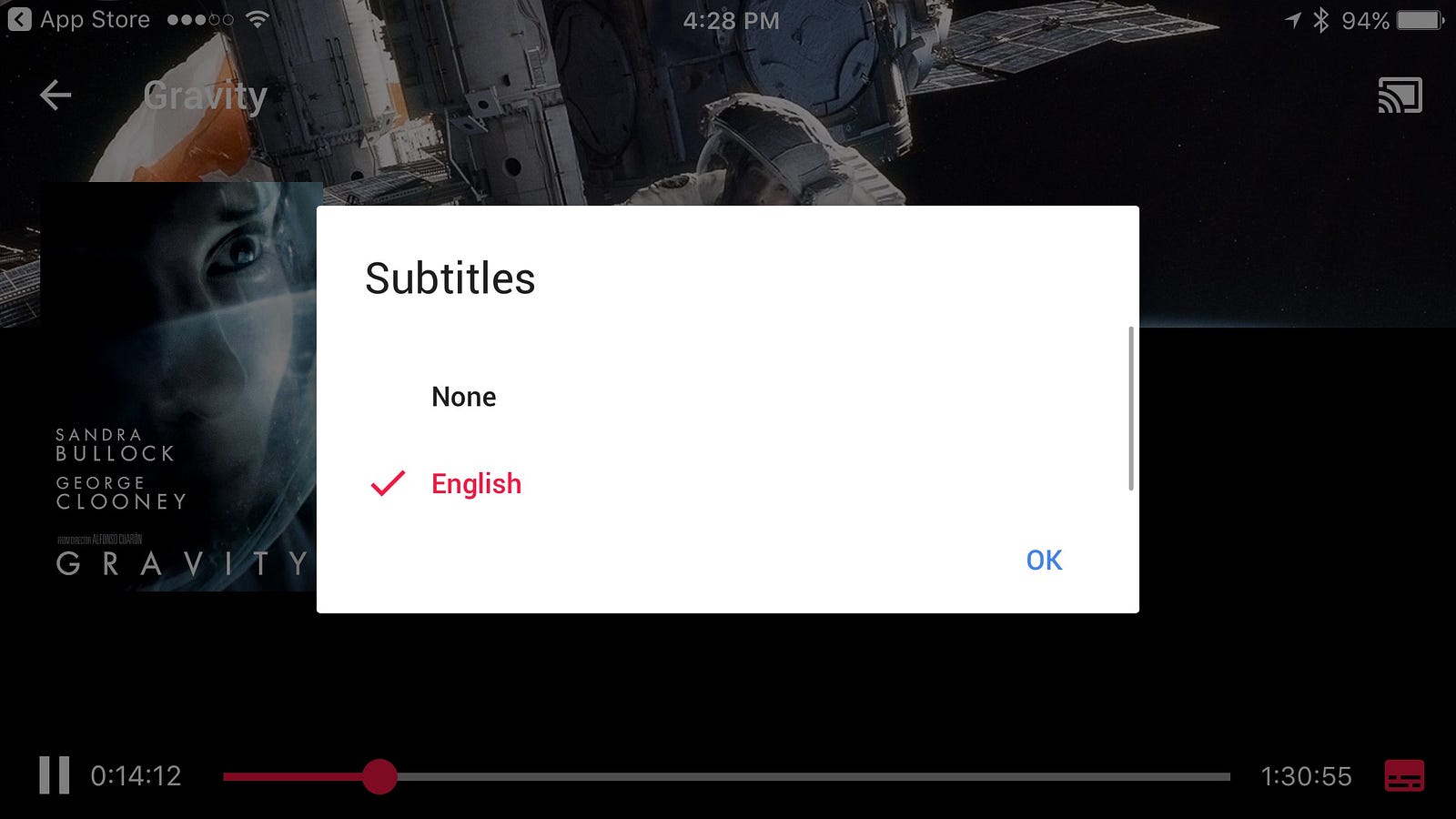
Let’s have a look at a few Subtitles experiences:
Apple — Even in the human interface guidelines there is not much about subtitles, just the accessibility options that do not include
BBC

Amazon — has nothing in their guidelines about subtitles beside the ability to turn them on and off.


Netflix — Loved their answer to why subtitles are important “Subtitles and closed captions have historically been deemed a secondary asset. Even our own technical specification lists subtitles and closed captions (timed text) among several types of secondary assets that NETFLIX requires. The reality is that for millions of our members around the world, timed text files are primary assets.”
Too bad it’s not reflected in the design of it.


Google — Google has lot of options and they are the only ones that allow font change, but still non of these fonts were designed for TV.

TV fonts special characteristics
Distance — Unlike other platforms the distance between the observer and the TV is the most static of all. Reading printed materials can be held in different distances and angles which affect the size and light emitted on the paper. On the mobile, the distance also changes depends on interaction and other elements that appear on screen.
TV is static, the subtitles are always at the same bottom area of the screen, and the distance also mostly remains the same. Of course, there are different distances people choose in their living rooms and sizes of TV, but that’s what accessibility settings are for. The TV size should immediately affect the size of the subtitles and it should be something that is adjusted as a part of setting up the TV.

Color — On TV the background is constantly changing. Therefore throughout the years, there were two main colors that were featured as default in subtitles: yellow and white. These two colors are less common on TV. It’s not easy to shoot things in yellow or pure white (unless it’s a scene in the snow). However, since the background keeps changing it is impossible to rely on one color or alternatively keep changing a color when its background changes. The next two solutions came as an addition to the color change.
Background — Many subtitles have text and behind it, there is a background. This helps to differentiate the font from the moving background while helping Readability and clarity. However, background is not the first choice most services do.
Stroke — I find it somehow strange that stroke is the most common way to make sure the text is visible in subtitles. The main reason is that fonts are not designed to have a stroke, they design to work as is. When a stroke is applied on a font it’s eating out of its fill or alternatively out of the negative space. That makes it much less readable. The most common usages of stroke are also featuring heavy contrast like Black contrast on white or yellow fill.

*In weird cases, few companies decided to place a shadow on the colored font. That’s terrible.
Speed — With subtitles it is essential to understand that the users don’t have all the time in the world to read them. In some languages, speech is faster or words are longer. In English, the average time for reading a subtitle line is 3 to 5 seconds. Therefor readability here is even more critical.

Multi-language — Mainly in countries that don’t dub TV shows there is a need to subtitles that are in a different language to the original movie. Some countries’ subtitles appear in two lines: First line is translated to the main country language and the second to a second language. In Israel for example, subtitles appear as Hebrew on the first title and Russian or Arabic on the second line. One can only imagine that this makes it extremely difficult to read if there is no consistency in the attributes between the two. There are fonts that are designed specially to match well with another language fonts. This should also be applied in TV.

The extra step
Throughout my exploration, I couldn’t find out where or who dropped the ball on this issue but I think it’s also a great opportunity. Companies have worked so hard creating and owning their own user experience across platforms. Especially now when linear channels ebbing and on-demand services are on the rise it’s time to invest and create an inclusive experience.
Typography is amazing and creating fonts for titles or posters is fabulous. Creating for readability takes longer and it’s less sexy but it provides an enormous value that lays in comfort rather than astonishing. Additionally, it’s fame for life across all of a provider’s services.
A font that takes into account stroke, colors and different backgrounds for speed reading on TV. A translation of the OS font to a proper subtitles font. I am hoping for a better, readable TV experience.
The world of subtitles is fascinating and there was incredible work done around it in terms of language, sentence design and following flow and content integrity. But after all this somehow the fonts had been neglected.
If you are interested and want to read more about subtitles try these:
BBC — http://bbc.github.io/subtitle-guidelines/#presentation
The most detailed one.
Apple Tv fonts — https://developer.apple.com/tvos/human-interface-guidelines/visual-design/
Not speaking about subtitles at all, just fonts
Google Material design — https://www.google.com/design/spec-tv/style/typography.html#
Not speaking about subtitles at all, just fonts
There are no design consideration, just structure and timing.