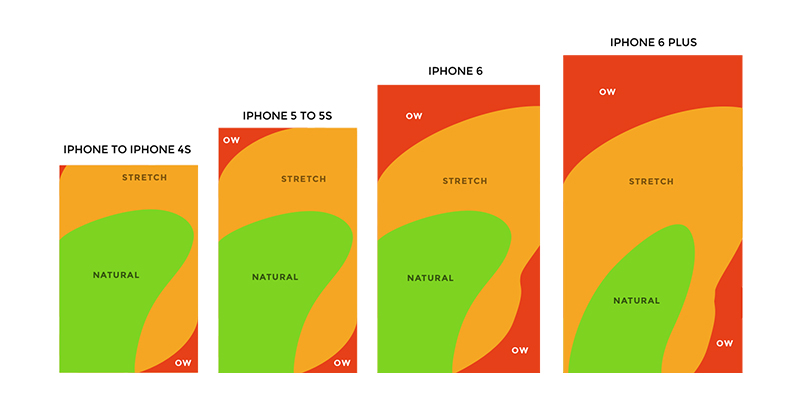
Facebook has mastered making users ignore the bottom middle button; one of the most comfortable navigation areas. Look at the diagram below, it’s evident that no matter which hand holds the phone it would have access to the most important area of the app. Instead they choose to use the bottom navigation for the promotion of their own new features which are far from the main use case.

Mark Zuckerberg said yesterday “You might have noticed all of the cameras that we’ve rolled recently” but didn’t share any usage statistics about them.
Let’s quickly dip into some examples:
In Facebook no one looks at the Buy section. This is a total mystery. I wonder who uses it? Seriously I don’t know anyone. Then there’s Facebook Stories, which offers nothing and as far as I’m aware are used by few people, yet they keep insisting on having it there.

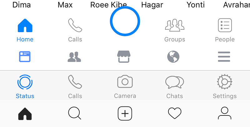
The bottom navigation points at a left to right priority. Feed first (main use case), Adding friends (rare case), Marketplace in the most important position (which no one use), Notifications (probably the most used button on them all), Settings.
In Instagram people don’t take pictures, they just add pictures they took on their camera app. It’s mainly because in the regular camera you have more options and it’s better to edit and then select from your gallery.

The bottom navigation is similar yet without text subtitles for the icons: Feed (main use case), Explore (quite popular), Take a photo (main thing Facebook whats you to do), Notifications, Settings.
Facebook Messenger
In Messenger no one uses the My Day camera feature.

The bottom navigation has a huge blue button that is laid out uncomfortably on top of your friends’ names and competes with the blue of the active tab. Priority is: Home-Explore + conversations (main use case), Calls (less used feature), Camera (let’s make it big so people use it), Groups (which has its own Facebook app), People (your contacts).
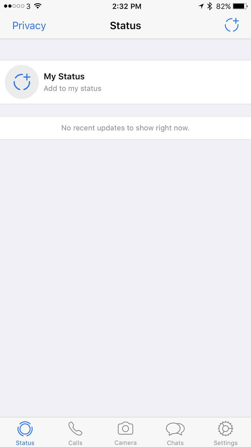
In WhatsApp no one uses the camera button.

In WhatsApp all of the priorities shifted. Status is not being used by anyone of my contacts, Calls (very popular use case), Camera (no one uses), Chats (main use case), Settings.
What do users want?
For such a huge company it’s embarrassing. It feels as though someone there doesn’t listen to the designers.

Let’s look at the core purposes of these platforms and my critique
Facebook — What do we use Facebook for? Reading news, asking questions to a community you care about, complaining, raising money, and stalking people you don’t really talk to.
Hence it’s completely not aligned. It seems like Facebook hasn’t decided what its main purpose is, news or people’s lives. It’s ok to try and have both and it kind of worked for a while in the feed, but once there are creation options that are based on both it just gets very confusing.
Messenger / WhatsApp — We use both of these for talking to friends.
Adding the camera is important for an easy way to share images in the chat, but for that button to create a story and have a global chat makes it feel like it’s introducing a new usage for these platforms. People usually talk to individuals or groups, not to everyone, and especially not to every contact they have. There isn’t even a proper way to target specific groups. In the use case of Snapchat the whole experience is extremely curated. You could argue that you can slightly curate in Facebook / Messenger, but in WhatsApp there is zero curation. In which case, who is this feature aimed at? Who realistically is going to use it, and who’s going to engage with the stories they share?

Instagram — A platform to follow your interests and share your life.
Stories is aligned with the initial purpose of Instagram, allowing people to only share photos they’ve just taken rather than using pre-photographed images. Providing a way for sharing photos from a user’s gallery really changed Instagram and in some ways it allowed professionals to outshine regular users with tools and talent. Stories offer another way of sharing which equalizes the field and has helped bringing back the originality and integrity of the content. However, since Snapchat allows you to upload pre-made video, I suspect all of the Facebook story platforms will allow it in the future, and then again this feature will lose its originality and integrity.

Conclusion
I love Facebook and all of their acquired companies. Each one is really good on its own. WhatsApp for the older generation, it’s light and fast. Messenger for a nicer, almost the nicest (second to Telegram) chat experience. Instagram for the amazing creation that keeps happening there. Facebook for the ability to see what my friends care about and participate in groups.
Now there is a something that has been tried in all of these apps without any thought about consistency or the advanced usage of their ecosystem. It’s a shame. The middle button / middle tab was supposed to be one of the main points of focus of the app, the core use case. But Facebook is telling us it’s not. In fact it seems like there is no logic behind the order in which menu items are sorted. Ultimately that diminishes the user experience, making it far from ideal.
