Facebook’s UX is killing the “home” button

Facebook has mastered making users ignore the bottom middle button; one of the most comfortable navigation areas. Look at the diagram below, it’s evident that no matter which hand holds the phone it would have access to the most important area of the app. Instead they choose to use the bottom navigation for the promotion of their own new features which are far from the main use case.

Mark Zuckerberg said yesterday “You might have noticed all of the cameras that we’ve rolled recently” but didn’t share any usage statistics about them.

Let’s quickly dip into some examples:

Facebook

In Facebook no one looks at the Buy section. This is a total mystery. I wonder who uses it? Seriously I don’t know anyone. Then there’s Facebook Stories, which offers nothing and as far as I’m aware are used by few people, yet they keep insisting on having it there.

The bottom navigation points at a left to right priority. Feed first (main use case), Adding friends (rare case), Marketplace in the most important position (which no one use), Notifications (probably the most used button on them all), Settings.

Instagram

In Instagram people don’t take pictures, they just add pictures they took on their camera app. It’s mainly because in the regular camera you have more options and it’s better to edit and then select from your gallery.

The bottom navigation is similar yet without text subtitles for the icons: Feed (main use case), Explore (quite popular), Take a photo (main thing Facebook whats you to do), Notifications, Settings.

Facebook Messenger

In Messenger no one uses the My Day camera feature.

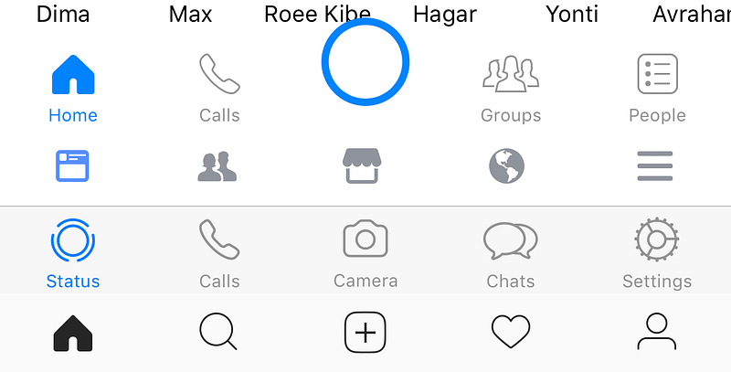
The bottom navigation has a huge blue button that is laid out uncomfortably on top of your friends’ names and competes with the blue of the active tab. Priority is: Home-Explore + conversations (main use case), Calls (less used feature), Camera (let’s make it big so people use it), Groups (which has its own Facebook app), People (your contacts).

WhatsApp

In WhatsApp no one uses the camera button.

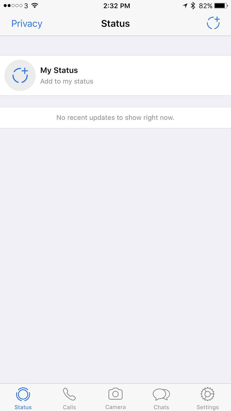
In WhatsApp all of the priorities shifted. Status is not being used by anyone of my contacts, Calls (very popular use case), Camera (no one uses), Chats (main use case), Settings.


What do users want?

For such a huge company it’s embarrassing. It feels as though someone there doesn’t listen to the designers.

Where users really look — http://uk.businessinsider.com/eye-tracking-heatmaps-2014-7?r=US&IR=T

Let’s look at the core purposes of these platforms and my critique

Facebook — What do we use Facebook for? Reading news, asking questions to a community you care about, complaining, raising money, and stalking people you don’t really talk to.

Hence it’s completely not aligned. It seems like Facebook hasn’t decided what its main purpose is, news or people’s lives. It’s ok to try and have both and it kind of worked for a while in the feed, but once there are creation options that are based on both it just gets very confusing.

Messenger / WhatsApp — We use both of these for talking to friends.

Adding the camera is important for an easy way to share images in the chat, but for that button to create a story and have a global chat makes it feel like it’s introducing a new usage for these platforms. People usually talk to individuals or groups, not to everyone, and especially not to every contact they have. There isn’t even a proper way to target specific groups. In the use case of Snapchat the whole experience is extremely curated. You could argue that you can slightly curate in Facebook / Messenger, but in WhatsApp there is zero curation. In which case, who is this feature aimed at? Who realistically is going to use it, and who’s going to engage with the stories they share?

Users mainly look at the middle and it is the easiest area for their fingers to touch on

Instagram — A platform to follow your interests and share your life.

Stories is aligned with the initial purpose of Instagram, allowing people to only share photos they’ve just taken rather than using pre-photographed images. Providing a way for sharing photos from a user’s gallery really changed Instagram and in some ways it allowed professionals to outshine regular users with tools and talent. Stories offer another way of sharing which equalizes the field and has helped bringing back the originality and integrity of the content. However, since Snapchat allows you to upload pre-made video, I suspect all of the Facebook story platforms will allow it in the future, and then again this feature will lose its originality and integrity.

The bottom navigation mess across Facebook’s apps = no consistency + changing hierarchies

Conclusion

I love Facebook and all of their acquired companies. Each one is really good on its own. WhatsApp for the older generation, it’s light and fast. Messenger for a nicer, almost the nicest (second to Telegram) chat experience. Instagram for the amazing creation that keeps happening there. Facebook for the ability to see what my friends care about and participate in groups.

Now there is a something that has been tried in all of these apps without any thought about consistency or the advanced usage of their ecosystem. It’s a shame. The middle button / middle tab was supposed to be one of the main points of focus of the app, the core use case. But Facebook is telling us it’s not. In fact it seems like there is no logic behind the order in which menu items are sorted. Ultimately that diminishes the user experience, making it far from ideal.

Finished copying Snapchat? What’s next in messaging

In the past year we’ve seen more copying than innovation in the world of messaging. In 2016 everyone did stories, disappearing messages etc. Instead of simply trying to mimic Snapchat there are other useful avenues to explore that can simplify people’s lives and increase engagement. In this article I will analyze key areas in the world of digital conversation and suggest practical examples of how it could be done.

What should be enhanced in messaging:

As users we spend most of our screen time communicating. Therefore there is a need for it to be easy and comfortable; every tap counts.

Part 1

Comfort — The product needs to be easy to adopt, following familiar patterns from real life and aggrandize them.

Rich messaging — Introducing new experiences that help users articulate themselves in unique ways. Charge the conversation with their personality.

Part 2

Automation — Reducing clutter and simplifying paths for repeated actions.

Control — A way for users to feel comfortable; to share more without proliferating vulnerability.

Rich messaging

Being rich in a wider sense means you have a variety of options and most of them are cheap for you. In a messaging UX context, cheap means content that is easy to create; interaction that helps deliver and sharpen the communication. Rich messaging can be embodied in the input and output. It is catered to the user’s context thus facilitating ongoing communication and increasing engagement.

In the past, and currently in third world countries, the inability to send large files including voice messages resulted in many people simply texting. This led more people to learn to read and write. Unapologetically text is harder to communicate with and primitive in terms of technology, hence why users have come to expect more.

Take voice input/output for example. It’s the perfect candidate as there is increasing investment in this area. Speaking is easy, in fact using sounds is the easiest way for humans to assimilate and share information.

There are scenarios where voice can be the preferred communication method, such as when you’re driving, when you’re alone in the room, when you’re cooking, and when you’re doing anything that keeps you relatively busy.

Here are a few examples for rich messaging:

Voice to text — Messaging is asynchronous and to drive engagement the goal is to strive for synchronous. It doesn’t matter how the content was created. What matters is that it is delivered to the other person in a form they can consume now!

Voice dictation has improved tremendously but somehow most of the focus has been on real-time. The nature of messaging dictates a non-real-time solution. It can be leveraged to give a better quality LPM (Language Processing Model) transcript result. For example, Baidu recently launched SwiftScribe which allows users to upload an audio file that the program transcribes.

Another recent example is Jot Engine, a paid service designed withinterviews in mind. I myself use Unmo and PitchPal to help me prepare for pitches.

They’re not perfect but they take away the guesswork of trying to understand someone in real-time. In a recording, the algorithm can search for context, see what the subject is and rework the language accordingly. I would argue that the result of someone sending you a voice message should be a transcript with an option to listen to the voice as well. As a user, you’d be able to listen to it or just read if you are in an environment that doesn’t allow you to use sound.

In another scenario when a user is in the car they should be able to listen and answer text messages that were sent to them.

Voice context attachment — A good example of this concept is the Livescribe pen. It allows users to write notes that are stored digitally while recording audio to add context. I admit, it’s a more novel idea that won’t be for everyone, but its potential is clear in a professional context.

Metadata — Other than location there are other metadata elements that can be kept with the messages. How fast you type, how strong you press the keyboard, where you are located, who is around you. The possibilities of enhancing the text and providing context are endless and have barely been explored.

It baffles me that no one has done this yet. The cloud actually has more capacity to interpret a message and learn from context. In photos apps like the ones by Google or Samsung, you can see more and more belief in context including location, details of the picture, live photo etc. All these elements should be collected and added when they are relevant.

Engagement and emotional reactions — With services like Bitmoji users can create their own personal stickers. An exaggerated instance of themselves. Seeing this in the world of video would be very interesting. Psychologically these stickers help users to enhance their emotions and share content in a way they wouldn’t if they were communicating in person.

In addition, Masks on Snow (live filters in Snapchat) also helps user express their feelings but at the moment it’s just some weird selection that has a fragment of a context to where they are or what they are doing. You can see how users just post themselves with a sticker not to tell a story but for the fun of it. If they could tell a story or reflect this on reality it would be emotionally usable which will elevate it as a mode of expression.

Comfort of Use

Comfort depends on the way users use the communication. Important relevant detail surfacing and accessible ways of communicating are the backbones of the UX.

Contextual pinning — Recently Slack added an incredible 90s feature “Threads”. If you’ve ever posted in a forum you know that this is a way to create a conversation on a specific topic. Twitter call it stories and Facebook are just using comments. But the story here was the conversion of this feature to the messaging world and that generated a lot of excitement among their users.

However, I see it as just a start. For example let’s say you and a few friends are trying to set up a meeting, and there is the usual trash talk going on while you’re trying to make a decision. Later another member of the group jumps into the thread but finds it really hard to understand. What has been discussed and what has been decided? If users could pin a topic to a thread, and accumulate the results of the discussion in some way it would be incredibly helpful. Then they could get rid of it when that event had passed.

Here is another good example

https://blog.google/

Accessibility

Image/video to message — instead of just telling a user “Jess sent you a picture or a video” you could actually try to tell the user something useful about that picture/video. Currently most notifications systems are limited to text so why not take advantage of the image processing mechanism that already exists? In other richer platforms you could convert the important pieces of the video to a Gif.

* In that context it’s quite shameful that Apple still doesn’t do bundling of notifications which really helps to tell the story the way it happened without spamming the user. I’m not sure I fancy Android O’s notification groups, but it’s definitely better than creating an endless list of notifications.

Voice type emojis — Keyboards are moving towards predictive emoji and text. They understand that having a different keyboard for emoji is a bit complex for the user, especially since they’re used a lot. A cool way to unify it is to create a language for emoji to make it easier to insert them into messages via voice.

In text translation — We’ve seen improvements from Skype immediate translation and Facebook / Instagram’s “Translate this”. Surely it makes more sense to have this in a chat rather than on the feed? I’m sure not too many people talk to other people in a different language, but if users had such a feature, they might do so. This could also be a great learning tool for companies and maybe it’ll help users to improve the translation algorithm.

See you in Part 2…