Category: Strategy
What happened Gmail?
I’m a Google Inbox user, and since Inbox for iOS hasn’t been updated to match the screen size of iPhone X (which seems quite a trivial thing to fix) every time I saw an update on the AppStore I jumped for joy thinking that the fix was coming. Each time I was disappointed and instead it was bug fixes, security, and the awful removal of the feature to ‘Swipe up/down’ to close an email that was replaced by a back button. I was left wondering, what’s going on? What is that team at Google doing? Then came the new Gmail and I realized that the resources had been shifted towards that. Optimistically, I tried it yesterday but unfortunately, it’s disappointing.

It is true that some nice, cool features have been introduced including: confidential mode (not really private), security features (a worthy inclusion), offline mode (amazing), Self disappearing emails (cool for my Inbox’s storage, not sure it’s not a gimmick from messaging apps like Telegram though), emails you cannot copy / print (unless you screenshot them), surfaced content in email, snooze, smart replies, and nudge (features that come from Inbox and are truly good), and side panel (don’t get me started).
In reality, they’ve done amazing development work but the design, and especially the user experience, got left behind in my opinion. Creating value is the core of UX and that’s probably the reason why people are still using hideous experiences like eBay, but Google works to a much higher standard than eBay. Google are the creators of one of the best design systems every created in tech, Material Design.
Here are the three main areas where I think the new Gmail misses big-time:
Orientation
Google is a search company and their goal is to map and organize the world, but unfortunately, they can’t organize our emails. For example, the other day my wife said she couldn’t use Google Drive anymore because she had run out of space and didn’t know how to free up more space. It took me some time to find the reason. She had 17,542 emails hidden in the Promotion and Update tabs, which ended up being 6GB.
Another example, how often do you have unread emails but you have no clue where they are? The solution to finding them is to search for Unread.

Google are doing a great job in findability, using the search box, but a poor job in surfacing what’s relevant for the user. Google know that they are doing a bad job at orientation and interface design. The number of ways in which you can organize your Gmail are proof of that. From Priority inbox, to Important, Unread, Automatic Tabs like Promotions and Updates, Labels, and Filters — they have tried a lot of things and kept them all within Gmail too. The only place where they made a good decision, in my opinion, was inside Inbox. I know many people who didn’t like Inbox and I’m not saying it’s perfect, but it’s doing a better job in every category I’m about to mention than Gmail is.
Material Design
When Material Design was introduced in June 2014 by Matías Duarte it was a historic moment for design. Google Material Design opened opportunities internally and globally for design standards, guidelines and a new way of creating design. Material Design is based on basic principles of papers, shadows, and elevation. It also added motion design as an important wayfinding mechanism for orientation across all of Google’s products. Sticking to basic principles helped reduce complexity and increase focus.
Gmail was never fully Material Designed though, and the new version is even further away from the design language that made Google and Android so good. For example:
- The Compose button in Gmail got this weird, unexplained Lego-like treatment and kept its place rather than becoming the floating action button. It’s a wild dream of someone who thought it looked fancy.

- The New G-Suite button is weirdly pixelated and has nothing to do with Material Design either. It looks like senior people in the company just said: “Make my logo bigger”.

- If the user decides to shrink some of the gazillion menus around the core reason for opening Gmail, they will see a series of unexplained icons. That is unlike many other Google services, which just let a minimised menu disappear. As a user, if I choose to get rid of it, I don’t want any relic of it for the time being. The hamburger button closes menus across all of Google’s services including: Inbox, YouTube, Analytics etc. but not in the new Gmail.


• Drop-down menus within drop-down menus and the inbox types we spoke of before. The copy is especially entertaining: “Try them all, keep what fits”; aka “We have no clue what works and we couldn’t decide so we passed this decision to you” (instead of placing it in settings).
- Menus, menus, and some more menus.In many of them you have unrelated actions.

For example: In the top menu you have (from left to right)
- Hamburger button — to shrink the left menus.
- Gmail logo — to refresh the page.
- Search bar — for searching in Gmail.
- Apps button — to go to other Google apps.
- Notifications button — from other Google apps.
- Profile picture — to manage your profile.
So they are at the same level and look the same, but on the left what you have is drop-down menus that take the user out of Gmail, while on the right and center are actions that relate to Gmail.
From a business perspective I understand that there are more people using Gmail than Calendar, Keep or the new Tasks, but the way Google has attempted to bring people into the fold and have them use add-ons and the rest of their products is just crazy. It’s a designer’s nightmare and it transports me back to the 90s when only developers were building web apps. Why do I mention the 90s? Well, it’s because it happens to look very similar to Outlook, AOL, and Yahoo, all from this era. All of these services still work amazingly well, but it’s not accurate to call what Google has done new. It’s the same thing in a new box, with the same problems and over complexity. It comes as no surprise that companies like Slack succeed by solving these problems.

“Google has 4 million people paying for G Suite right now, compared to 120 million Office 365 commercial users….1.4 billion people are using Gmail, compared to 400 million on Microsoft’s Outlook.com service.” (The Verge)
There is more functionality and design here than on an airplane dashboard.
Innovation
Cross-selling, merging, and doing a Frankenstein is not innovation. Moving features from one service to another is also not innovation. Even though it’s impossible to innovate every year, I would hope that within one of the core products at Google there is a willingness to innovate. When I hear of a redesign I’m always excited, and I’m still excited about the fact that something has changed with Gmail, even if it’s not enough to get me to go back to using it.

Here are a few of the innovations that are needed:
- A good method for telling users what’s important to read and what can wait for later.
• A way to help users handle the amount of emails they get.
• An efficient way to categorize, filter and search content.
• New ways of passing information (from media types, to supported files for preview).
• A tool to help users fix mistakes they’ve made, such as sending someone the wrong email, or spelling something incorrectly.
• Providing an efficient way of sending big files (Drive works to some extent, but it’s cumbersome in many cases).
• Allowing users to handle their business better through Gmail (e.g. sign documents, approve things, review things).
• Allowing users to design their emails in a better way.
• Letting users know if someone read their presentation and what parts interested them (DocSend).
All of these are focused on the core usage of Gmail: communicating with information. Ideally, you don’t need emails to schedule a meeting because emailing is slow, complicated and sometimes requires too much coordination. That’s why you have tools like X.AI (Amy), Calendarly and Doodle. Tasks are also way better informed by chatter rather than an email.
Google’s product manager Bank said, “Inbox is the next-gen, early adopter version, whereas Gmail is the flagship that will eventually get the best new features”. If Inbox is the next-gen then why isn’t it updated on iOS? If Gmail gets the best features does that mean it will become a pile of features without real focus for the true purpose of what an email service is? When does Gmail remove things that don’t work, or at least hide them?
In the new Gmail, instead of innovation, there was aggregation. A KPI hungry complexity. I’m sure this design will rattle up numbers, but I’m also sure it’s not iterating to address users’ problems.
Where will ads live? The answer: Hardware
There are countless businesses that build their value on the back of ads. Shamefully it became the default reaction to “what’s your business model? Advertising”. Because of this, ads became more hated than ever. Yet there is barely any supervision for the content that is in ads. With the absence of supervision in this space there is a major opportunity: To grab the last touch point, and make it useful and workable for the customer. Let’s dive in.
Trust the medium?
Newspapers are a medium, a format that ads are distributed through. As well as charging companies to place adverts, consumers paid to read the papers, and therefore to see the adverts. Before the rise of the internet, the monopoly over information that people wanted to read made it feasible to charge the two sides of the market, the customer and the advertiser. Newspapers were better the more distribution they had.
As power accumulated so did money. Norms started appearing, and with them a code of conduct. Many of the people who worked in the information business were creatives. For example: journalists, editors, and photographers. This led to the creation of unions, enforcing the code of conduct and ethics. People ended up buying the newspaper for its name which symbolized some sort of truth. Authors were relentless in their pursuit of the truth while telling a good story. Today most people don’t know where an article came from “I just saw it on Facebook”, let alone who wrote it.
People spend less writing time per article today in comparison to the past. Articles are distributed through undifferentiated platforms and mutate according to the platform. Likes are dismissive, comments are mostly superficial – three words or an emoji. Mini boredom is solved by minimal non-obligatory interactions and people have short attention spans.
Ads kept their place in this world, dollars follow attention and distribution, not ethics. Ads moved where the information did; after all, ads are also some sort of information that someone wants to provide. An ad’s trustworthiness is created by grabbing attention and using public / attractive figures. These address the truth or utopia, whims of dreams.
Trust the distributors?
It is always said that when you control the distribution you can control the knowledge. Only in the past there were more layers to filter ads, based on the content that editors wanted to correlate with their brand and standards. But a paradigm shift happened, the choice now belongs to the people. Your friends can post whatever they want to and companies can target whoever they feel like. Because of scale, there is less of a critical eye being cast over what is exposed to the public.
The other day a friend of mine wanted to publish a campaign on Instagram. He filmed his music studio, but upon uploading it the Instagram algorithm claimed that text appeared in his video, thus blocking the campaign. In response, he requested that they look at it manually because it, in fact, didn’t include any text. A few days passed and they approved the campaign. AI is not smart enough to even determine whether there is text in a video, I don’t expect it to judge the content anytime soon.
Big money was always in the game. Many newspapers and media companies are owned by political bodies. That’s exactly the reason that today if you pick up The Guardian you know what to expect, and the same is true if you watch Fox News. Most platforms don’t have anyone editorial, or legal, looking at anything that comes online. Until recently nobody was interested in standardizing ads, their content or their mechanism.
Trust today’s solutions?
Throughout history, many people have tried to avoid specific types of content, ads among them. One of the key marketed benefits of having a remote control was to skip a channel when ads are on TV. When VCRs arrived people recorded shows and fast-forwarded ads. People loved the concept of controlling the content. Today cord cutters also prefer it to cable TV because they want to see what they want to see without ads. In fact they care less about where the content came from, and are more interested in just consuming it.
As an example, Netflix built on the lack of care shown by customers and so did cable companies. But now TV companies try to differentiate themselves because they do care about exclusivity, and therefore want to create a lockdown mechanism. Once it is strong enough, I believe that even paying customers will see ads again.
2016 was a big year for Ad Blockers. As the number of people who installed an Ad Blocker rose above 20% the advertising industry and the distributors realised it’s a big problem. The reactions varied:
- Block every user that has Ad Blocker from watching any content
- Make a paywall for content without ads and give away some content for free
- Show parts of the content
- Beg for users to remove their Ad Blocker
- Say they ethically request users to remove it so they (the distributor, content maker) can support themselves.
But only halfway through the year, new voices arose calling for ads to be standardized. These voices looked at the problem at hand. With today’s accurate tracking and personalization, why would people block ads? The answer is that ads are a jungle full of clickbait ads, spam, viruses, ads that hurt the user experience and take over the whole screen, ads that play sudden loud music or open unwanted windows, the list goes on. So they decided to try and work on standardizing ads, and at some point, they will have some teeth. But in the meantime…
People discovered Ad Blockers and even if there were some ads they didn’t mind seeing, they just wanted to get rid of it all completely because the bad and interruptive ads outweighed the good and targeted ads. Ad Blocker was such a hit that it caught both Apple and Google’s attention. We can already see seeds of their work in updates they did recently.
Apple’s cookie tracking blocker mechanism in IOS 11’s Safari has reportedly cost media companies around 200 million dollars. Google is bringing an integrated ad blocker to Chrome. Probably to block everyone else’s ads and prioritize their own. They are both trying to prevent users from choosing services like adBlocker Plus.
This kind of service makes its money by allowing specific ads to go through the filter. This allows them to get paid, it’s their business model. Do we trust Google more than we trust adBlocker Plus? I really don’t know, but it seems like it’s a good idea to be able to avoid a monopoly on this front. It seems that the EU is also eying this area.
Who to trust?
Privacy and ads seem to be an especially good opportunity for aggregators that have a leg in the hardware world. Why? Because hardware is the actual touch point for the customer. You could argue that you watch Netflix on TV but I would argue that you watch TV!
For many years hardware companies took the wrong steps to catch up with startups and software companies. Among these wrong steps, we have the cases of bloatware (adding unnecessary apps to your phone, hoping that you will use them), and creating competing software that wasn’t good or innovative enough etc. But now it seems companies like Apple and Amazon understand that they will never have a better app than a competitor that is working on it exclusively. By becoming a smart aggregator, and applying regulations and ethics, the last touch point can become the only touch point.
Here are a few examples:
Apple pulling out an app from the app store because it’s competing with a service they are about to launch, or inappropriately using one of their devices.
Apple’s TV app aggregates TV shows and movies from all the apps that are installed on the Apple TV. If you add Apple’s future original content it’s a very powerful touch point.
Amazon creating an API for developers to use Alexa, controlling what information they give to developers.
Facebook’s single sign in, which allows users to signup and protect their information to a certain extent.
It is essential for hardware companies to know what’s going on within each app that is on their devices. Of course Facebook will never agree to give Google all its info about what you do on your device. But in reality, Google look at what you type on your keyboard, and they also know how long you spend in the app. That is already very valuable information.
Imagine you are watching a TV show on live TV and when the ads start the TV blocks them, or changes the channel to something else (your second option) until the ads end. Imagine the TV making sure you watch an ad that is relevant to you, like on the internet. Instead of watching a tampon ad you’ll see a PlayStation game ad. Imagine physical ads on the street that will react to your profile.
I believe that this is the future that companies like Google, Apple, Amazon and Facebook imagine. A future where controlling the touch point allows them to set rules that will make the user experience better, that will target us personally with things that interest us (or that will affect us – depending on how dark we want to be). The company that controls the last step of the interaction, the physical touch point, is the company that can call the shots. This is one of the main reasons why every big software firm tries to branch out into hardware.
When a user is using your software the user is your product. You will do anything in your power to retain them and you will make money out of them however you can (ads, upgrades etc.). When a user buys your device the user is your customer and the device is your product. You will do everything you can to make your device better. Thus you will want them to have the best experience possible. Ads wouldn’t interest you because it’s not how you’d make money. You’d make money by selling your device and creating the best experience. And that wouldn’t include ads, unless you are a newspaper 🙂
Facial recognition as a UX driver. From AR to emotion detection, how the camera turned out to be the best tool to decipher the world

The camera is finally on stage to solve UX, technology and communication between us all. Years after the Kinect was trashed and Google Glass failed, there is a new hope. The impressive technological array that Apple minimized from a PrimeSense to the iPhone X is the beginning of the way for emotion dependent interactions. It’s not new, it’s better than that, it’s commercialized and comes with access to developers.

Recently Mark Zuckerberg mentioned that a lot of Facebook’s focus will be on the camera and its surrounding. Snapchat have defined themselves as a camera company. Apple and Google (Lens, Photos) also are heavily investing in cameras. There is a tremendous power in the camera that is still hidden and it’s the power to detect emotions.
Inputs need to be easy, natural and effortless

When Facebook first introduced emojis as an enhanced reaction to the Like I realised they were onto something. Facebook chose five emotions that would be added and essentially help them understand emotional reactions to content better. I argued that it is essentially a glorified form of the same thing; but one that works better than anything else. In the past Facebook only had the Like button while YouTube had the Like and Dislike buttons. But these are not enough for tracking emotions, and cannot bring too much value to researchers and advertisers. Most people expressed their emotions in comments, and yet there were more likes than comments. The comments are text based, or even image/Gif which is harder to analyze. That is because there are many contextual connections the algorithm needs to guess. For example: how familiar is that person with the person he reacts to and vice versa? What’s their connection with the specific subject? Is there sub text/slang or anything related to previous experience? Is that a continued conversation from the past? Etc. Facebook did a wonderful job at keeping the conversation positive and prevented something like the Dislike button from pulling focus, which could have discouraged content creators and shares. They kept it positively pleasant.
Nowadays I would compare Facebook.com to a glorified forum. Users can reply to comments, like (and other emotions). We’ve almost reached a point where you can like a like 😂. Yet it is still very hard to know what people are feeling. Most people that read don’t comment. What do they feel while reading the post?
The old user experience for cameras
What do you do with a camera? Take pictures, videos, and that’s about it. There has been huge development in camera apps. We have many features there that are related to the surroundings of the main use case; things like HRD, Slow mo, portrait mode etc.

Based on the enormous amount of pictures users generated there was a new wave of smart galleries, photo processing, and metadata apps.

However, there has been a change in the focus recently towards the life integrated camera. A stronger combination of the strongest treats and best use cases for what we do with mobile phones. The next generation of cameras will be fully integrated with our lives and could replace all these other input icons in a messaging app (microphone, camera, location).
It is not a secret that cameras were amongst the three main components that have been constantly developed at a dizzying pace: The screen, the processor, and the camera. Every new phone that came out pushed the limits of that year after year. For cameras, the improvements were in the realm of megapixels, movement stabilization, aperture, speed and, as mentioned above, the apps. Let’s look at a few products that were created by these companies to evaluate the evolution that happened.

Most of the development focused on the back camera because, at least initially, the front camera was perceived to be used for video calls only. However, selfie culture and also Snapchat changed it. Snapchat’s masks, which were later copied by everyone else, are still a huge success. Face masks weren’t new, Google introduced them way back, but Snapchat was more effective at putting them in front of people and growing their use.
Highlights from memory lane
In December 2009 Google introduced Google Goggles, which was the first time that users could use their phone to get information about things that are around them. The information was mainly about landmarks initially.

In November 2011 on the Samsung Nexus, they introduced facial recognition to unlock the phone for the first time. Like many other things that are done for the first time, it wasn’t very good and therefore scrapped later on.

In February 2013 Google released Google Glass which had more use cases because it was able to receive additional input other than just from the camera, like voice. It was also always there and present but it essentially failed to gain traction because it was too expensive, looked unfashionable, and triggered an antagonistic backlash from the public. It was just not ready for prime time.

Devices so far only had a limited amount of information available at their disposal. It was audio visual with GPS and historical data. But it was limited: Google Glass displayed the information on a small screen near your eye which made you look like an idiot looking at it and prevented you from looking at anything else. I would argue that putting such technology on a phone for external use is not just a technological limitation but also a physical one. When you focus on the phone you cannot see anything else, your field of view is limited, similar to the field of view in UX principles for VR. That’s why there are some cities that make routes for people who are on their phone and traffic lights that help people not to die while walking and texting. A premise like Microsoft’s Hololens is much more aligned with the spatial environment and can actually help users interact rather than absorb their attention and put them in danger.


In July 2014 Amazon introduced the Fire Phone. It featured four cameras at the front. This was a breakthrough phone in my opinion; even though it didn’t succeed. The four frontal cameras were used for scrolling once the user’s eyes reached the bottom, and created 3D effects based on the accelerometer and user’s gaze. It was the first time that a phone used the front camera as an input method to learn from users.

August 2016 Note 7 was launched with iris scanning that allows users to unlock their phones. Samsung resurrected an improved facial recognition technology that rested on the shelf for 6 years. Unfortunately just looking at the tutorial is vexing. Looking at it made it clear to me that they didn’t do too much user experience testing for that feature. It is extremely disturbing to hold this huge phone and put it exactly 90° parallel to your face. I don’t think it’s something anyone should do in a street. I do understand it could work very nicely with Saudi women who have covered their faces. But the Note 7 exploded, luckily not in people’s faces while doing iris scanning or VR, and this whole concept waited for another full year until the Note 8 came out.

By that time no one mentioned that feature. All it says is that it’s an additional way of unlocking your phone in conjunction with the fingerprint sensor. My guess is that this is because it’s not good enough or Samsung wasn’t able to make a decision (similarly to the release of the Galaxy 6 and 6 Edge). Similarly, for something to succeed it needs to have multiple things you can do with it, otherwise, it risks being forgotten.
Google took a break and then in July 2017 they released the second version of Glass as a B2B product. The use cases became more specific for some industries.

Now Google is about to release the Google Lens to bring the main initial Goggles use case to the modern age. It’s the company’s effort to learn more about how to use visual with additional context, and to figure out the next type of product they should develop. It seems that they’re leaning towards a camera that is wearable.

There are many others that are exploring visual input as well. For example, Pinterest is seeing huge demand for their visual search lens and they intend to use it for searching for familiar things to buy and to help people curate.

Snapchat’s spectacles that allow users to record short videos so easily (even though the upload process is cumbersome).

Now Facial Recognition is also on the Note 8 and Galaxy 8 but it’s not panning out as well as we’d hoped it would.

Or https://twitter.com/MelTajon/status/904058526061830144/video/1
Apple is known for being slow to adopt new technology in relation to its competitors. But on the other hand, they are known for commercializing them. Like, for example, the amount of Apple Watches they sold in comparison to other brands. This time it was all about facial recognition and infinite screen. There is no better way of making people use it than removing any other options (like the Touch ID). It’s not surprising, last year they did this with Wireless Audio (removing the headphone jack) and USB C on the MacBook Pro (by removing everything else).

I am sure that there is a much bigger strategic reason to why Apple chose this technology at this specific time. It’s to do with their AR efforts.

Face ID has some difficulties that immediately occurred to me, like Niqāb (face covers) in Arab countries, plastic surgery and simply growing up. But the bigger picture here is much more interesting. This is the first time that users can do something they naturally do with no effort and receive data that is much more meaningful for the future of technology. I still believe that a screen that can completely read your fingers anywhere is a better way, and it seems like Samsung is heading in that direction (although rumors claimed that Apple tried to do it and failed).

So where is this going? What’s the target?
In the past, companies used special glasses and devices to do user testing. The only output they could give in regards to focus were Heat Maps – using the mouse they were looking at interactions and they were looking out where people physically look. Yet they weren’t able to document users’ focus, emotions, and how they react to the things they see.

Based on tech trends it seems like the future involves Augmented Reality and Virtual Reality. But in my opinion, it’s more about Audio and 3D Sound, and Visual Inputs; gathered simultaneously. This would allow a wonderful experience such as being able to look anywhere, at anything and get information about it.
What if we’d be able to know where the users are looking, where their focus is? For years this is something that Marketing and Design professionals have tried to capture and analyze. What can be better to do that than the set of arrays a device like the iPhone X has as a starting point? Later on, this should evolve into glasses that can see where the user’s focus is.
Reactions are powerful and addictive
Reactions help people converse, raise retention and engagement. Some apps offer post reaction as a message that one can send to their friends. There are some funny videos on YouTube of reactions to a variety of videos. There is even a TV show dedicated solely to people watching TV shows called Gogglebox.
In Google, IO Google has decided to open the option to pay creators on its platform, kind of like what the brilliant Patron site is doing but in a much more dominant way. A way that helps you as someone from the crowd to stand up and grab the creator’s attention called SuperChat.
https://www.youtube.com/watch?v=b9szyPvMDTk
I keep going back to Chris Harrison’s student project from 2009. In this he created the keyboard that has pressure sensing in the keys and if you type strongly it basically read your emotions that you’re angry or excited and the letters got bigger. Now imagine combining it with a camera that sees your facial expression and we all know people express their emotions whilst they’re typing something to someone.
https://www.youtube.com/watch?time_continue=88&v=PDI8eYIASf0
How would such UX look?
Consider the pairing of a remote and the focus center point in VR. The center is our focus but we also have a secondary focus point, which is where the remote points. However, this type of user experience cannot work in Augmented Reality, well unless you want everything to be very still and walk around with a magic wand. To be able to take advantage of Augmented Reality, which is one of Apple’s new focuses, they must know where the user’s focus lies.

What started as AR Kit and Google’s ARCore SDKs will be the future of development not only because of the amazing output, but also because of the input that they can get from the front and back cameras combined. This will allow for a greater focus on the input.
A more critical view on future developments

While Apple opened the hatch for facial recognition to trigger reactionary Animojis it is going to get much more interesting when others start implementing Face ID. Currently, it is manifested in a basic harmless way, but the goal remains to get more information! Information that will be used to track us, sell to us, learn about us, sell our emotional data and to allow us to have immersive experiences nonetheless.

It is important to say that the front camera doesn’t come alone, it’s finally the expected result of Apple buying PrimeSense. The array of front-facing technology includes an IR camera, depth sensor etc. (I think they could do well with a heat sensor too). It’s not necessarily that someone will keep videos of our faces using the phone, but rather there will be a scraper that will document all the information about our emotions.


Summary
It is exciting for Augmented Reality to have algorithms that can read our faces. There have already been so many books about identifying people’s facial reaction, but now it’s time to digitize that too. It will be wonderful for many things. For example, robots that can look and see how we feel and react to those emotions, or on our glasses to get more context for what we need them to do. Computationally it’s better to look at the combination of elements because that is the thing that creates the context that helps the machine understand you better. It could be another win for companies that have ecosystems which can be leveraged.
The things you can do if you know what the user is focusing on are endless. Attaining that knowledge is the dream of every person that deals with technology.
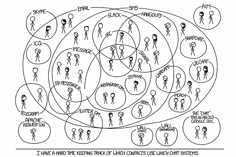
Finished copying Snapchat? What’s next in messaging

In the past year we’ve seen more copying than innovation in the world of messaging. In 2016 everyone did stories, disappearing messages etc. Instead of simply trying to mimic Snapchat there are other useful avenues to explore that can simplify people’s lives and increase engagement. In this article I will analyze key areas in the world of digital conversation and suggest practical examples of how it could be done.
What should be enhanced in messaging:
As users we spend most of our screen time communicating. Therefore there is a need for it to be easy and comfortable; every tap counts.
Part 1
Comfort — The product needs to be easy to adopt, following familiar patterns from real life and aggrandize them.
Rich messaging — Introducing new experiences that help users articulate themselves in unique ways. Charge the conversation with their personality.
Part 2
Automation — Reducing clutter and simplifying paths for repeated actions.
Control — A way for users to feel comfortable; to share more without proliferating vulnerability.
Rich messaging
Being rich in a wider sense means you have a variety of options and most of them are cheap for you. In a messaging UX context, cheap means content that is easy to create; interaction that helps deliver and sharpen the communication. Rich messaging can be embodied in the input and output. It is catered to the user’s context thus facilitating ongoing communication and increasing engagement.
In the past, and currently in third world countries, the inability to send large files including voice messages resulted in many people simply texting. This led more people to learn to read and write. Unapologetically text is harder to communicate with and primitive in terms of technology, hence why users have come to expect more.
Take voice input/output for example. It’s the perfect candidate as there is increasing investment in this area. Speaking is easy, in fact using sounds is the easiest way for humans to assimilate and share information.
There are scenarios where voice can be the preferred communication method, such as when you’re driving, when you’re alone in the room, when you’re cooking, and when you’re doing anything that keeps you relatively busy.
Here are a few examples for rich messaging:
Voice to text — Messaging is asynchronous and to drive engagement the goal is to strive for synchronous. It doesn’t matter how the content was created. What matters is that it is delivered to the other person in a form they can consume now!
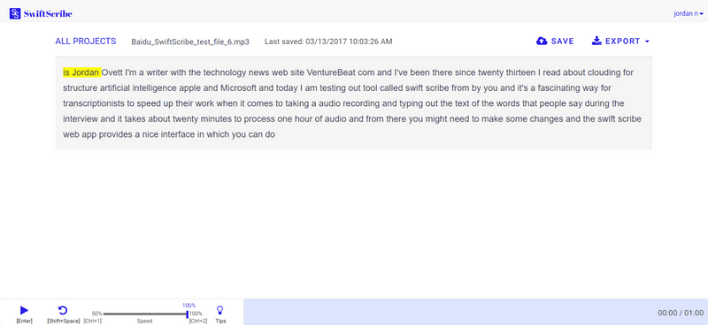
Voice dictation has improved tremendously but somehow most of the focus has been on real-time. The nature of messaging dictates a non-real-time solution. It can be leveraged to give a better quality LPM (Language Processing Model) transcript result. For example, Baidu recently launched SwiftScribe which allows users to upload an audio file that the program transcribes.
Another recent example is Jot Engine, a paid service designed withinterviews in mind. I myself use Unmo and PitchPal to help me prepare for pitches.
They’re not perfect but they take away the guesswork of trying to understand someone in real-time. In a recording, the algorithm can search for context, see what the subject is and rework the language accordingly. I would argue that the result of someone sending you a voice message should be a transcript with an option to listen to the voice as well. As a user, you’d be able to listen to it or just read if you are in an environment that doesn’t allow you to use sound.
In another scenario when a user is in the car they should be able to listen and answer text messages that were sent to them.
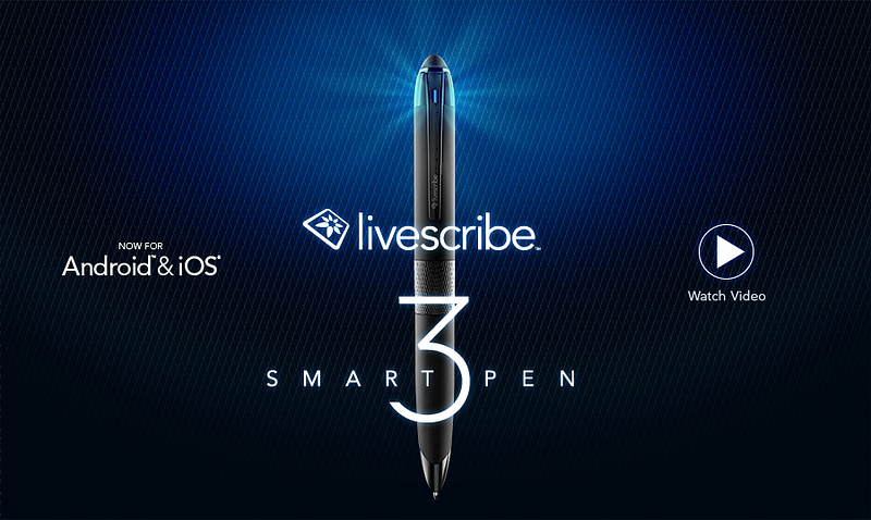
Voice context attachment — A good example of this concept is the Livescribe pen. It allows users to write notes that are stored digitally while recording audio to add context. I admit, it’s a more novel idea that won’t be for everyone, but its potential is clear in a professional context.
Metadata — Other than location there are other metadata elements that can be kept with the messages. How fast you type, how strong you press the keyboard, where you are located, who is around you. The possibilities of enhancing the text and providing context are endless and have barely been explored.
It baffles me that no one has done this yet. The cloud actually has more capacity to interpret a message and learn from context. In photos apps like the ones by Google or Samsung, you can see more and more belief in context including location, details of the picture, live photo etc. All these elements should be collected and added when they are relevant.
Engagement and emotional reactions — With services like Bitmoji users can create their own personal stickers. An exaggerated instance of themselves. Seeing this in the world of video would be very interesting. Psychologically these stickers help users to enhance their emotions and share content in a way they wouldn’t if they were communicating in person.
In addition, Masks on Snow (live filters in Snapchat) also helps user express their feelings but at the moment it’s just some weird selection that has a fragment of a context to where they are or what they are doing. You can see how users just post themselves with a sticker not to tell a story but for the fun of it. If they could tell a story or reflect this on reality it would be emotionally usable which will elevate it as a mode of expression.
Comfort of Use
Comfort depends on the way users use the communication. Important relevant detail surfacing and accessible ways of communicating are the backbones of the UX.
Contextual pinning — Recently Slack added an incredible 90s feature “Threads”. If you’ve ever posted in a forum you know that this is a way to create a conversation on a specific topic. Twitter call it stories and Facebook are just using comments. But the story here was the conversion of this feature to the messaging world and that generated a lot of excitement among their users.
However, I see it as just a start. For example let’s say you and a few friends are trying to set up a meeting, and there is the usual trash talk going on while you’re trying to make a decision. Later another member of the group jumps into the thread but finds it really hard to understand. What has been discussed and what has been decided? If users could pin a topic to a thread, and accumulate the results of the discussion in some way it would be incredibly helpful. Then they could get rid of it when that event had passed.
Here is another good example

Accessibility
Image/video to message — instead of just telling a user “Jess sent you a picture or a video” you could actually try to tell the user something useful about that picture/video. Currently most notifications systems are limited to text so why not take advantage of the image processing mechanism that already exists? In other richer platforms you could convert the important pieces of the video to a Gif.
* In that context it’s quite shameful that Apple still doesn’t do bundling of notifications which really helps to tell the story the way it happened without spamming the user. I’m not sure I fancy Android O’s notification groups, but it’s definitely better than creating an endless list of notifications.
Voice type emojis — Keyboards are moving towards predictive emoji and text. They understand that having a different keyboard for emoji is a bit complex for the user, especially since they’re used a lot. A cool way to unify it is to create a language for emoji to make it easier to insert them into messages via voice.
In text translation — We’ve seen improvements from Skype immediate translation and Facebook / Instagram’s “Translate this”. Surely it makes more sense to have this in a chat rather than on the feed? I’m sure not too many people talk to other people in a different language, but if users had such a feature, they might do so. This could also be a great learning tool for companies and maybe it’ll help users to improve the translation algorithm.
See you in Part 2…
You must be logged in to post a comment.