The Shredder framework

The Shredder is a method I’ve developed to try to unravel strategies whether they are for companies or products. The process of understanding requires gathering information and information in the world can appear in many different formats, it’s almost like going through a company’s shredded confidential paper bin and trying to connect it.

The Shredder can help you:

Understand your own company – Let’s face it, most of the employees in most companies don’t understand the company’s strategy, and are trying to suggest things that seem to be randomly accepted by management. Using The Shredder you’d be able to understand decisions better.

Be clear about your own strategy – If you work in a startup or any fast pace situation you might not have a strategy and are developing it gradually whereas your employees are thirsty for clarity. The Shredder will help them give you feedback, and together you’d be able to identify actions and lead them towards a tactic (the series of actions you do instinctively). From there it’ll be logical to measure what worked and develop that into a strategy.

Understand other companies’ strategies and anticipate their future actions – No one works in ether, we all have competition and we all need to understand where they are at and where they are going. The Shredder would allow you to understand your competitors’s strategy better and identify what worked for them and why.

The Shredder helps people identify the pieces and figure out how to connect them. This isn’t an exact science and you’ll create informed theories, but as time progresses you will be able to improve your accuracy of predictions, and in any way, this is a great way to get a team up to date with a situation in a company or another and align between people.

The Why

The Shredder session is a strategic analysis framework I created a long time ago and in this constellation, it was catered to help our newly born product function at iwoca to learn how to think strategically by analyzing competitors. Analyzing other companies is essential for self-improvement and is a muscle that when used right can yield massive improvements in how we approach product development. 

In preparation for a Shredder session, you  select a company or a product to focus on. The participants will get specific homework in preparation for the session. The homework will include researching the company and documenting it in a very specific way that will later on feed into the overall framework. This is plainly healthy meeting culture, set agenda and come prepared. The company that we choose isn’t necessarily competition, but rather a company we can learn from. At times we will focus on public companies which allows us to get more pieces of information together. In the end it’s about the construct of the people in the room and the area we want to explore. The parameters I consider when preparing for a session is how macro is the thing we are shredding in relation to the time we have. 

No matter what role you do in the product team it’s always good to escape from the day-to-day product activities to look at other products, different user needs, doubting things and asking the five whys – to get to the source of actions, and ways of operating. A strategy is an organization’s set of choices of what to do and what not to do. Exploring these leads to tradeoffs that we want to find and take advantage of.

Framework

The metaphor I want to use for The Shredder session is of a tree (sapling). Even though what we find at the end are shredded pieces of information they all come from the tree. During the session, we are trying to understand and map the company as a life form. Essentially we are doing reverse engineering, therefore we can’t start naturally from the trunk. In fact, we will start with everything but the truck in order to find out how it looks and what flows inside.

The company’s world / parts

Reproduction [visible]

Fruits – These are the product that the company launched. They can be either fertile or premature. Inside the fruits, there are seeds that breed more trees. This is what companies sell.

Flowers – pre fruit are pollination mechanisms and can be investors, customers, API endpoints, partners. This is how companies have sex with others.

Collection [visible]

Leaves – Every successful meeting or relationship creates leaves. This is how people photosynthesise from one another on the way to the products that are built. 

Branches – These are the paths that teams take to breed products. Not all paths lead to successful products, some just to leaves or nothing. Sometimes companies need to cut branches to focus on core products.

Base [invisible]

Trunk and what’s inside – This is the strategy and how teams function internally. It’s all hidden inside a thick layer of protection and even if you cut through it it’s hard to understand exactly how things really work inside. The only way to do that is to penetrate which is illegal.

Roots – These are the founders, the c-suite, the team and how they are orchestrated to feed into the strategy and the company goals.

Effectors [visible]

These are a sum of external things that affect the growth of the tree.

Eaters – The tree can feed a lot of things, but this refers to customers across their types.

Fertilizers – investors, partners.

Parasites/Insects – These are life-sucking creatures that feed on the company but don’t contribute to its growth.

Soil  – This is where the company seats in terms of industry, addressable market etc.

Weather – These are a set of conditions that allows the company to grow, from regulation (air), to how other companies operate (water), hype (sun).

Notice I labeled what is visible and what isn’t. Everything that is visible is out for grabs and can be researched and utilized in our path towards understanding a company’s strategy.

The process

In order to shred a company, we first gather information through different lenses, by different disciplines of people. This happens in the homework phase, but even more when we lay it all out in the open and people look at it through different lenses. When we conduct sessions, we’ll bring product managers, analysts, designers, developers, etc. This allows us to break down a company or a product into the smallest bits. It’s similar to mimicking their org inside our room. Breaking their organization down to these pieces allows us to estimate where they invest and where they need to improve.

Information top & bottom

This is where we look at anything we can find out in the world. It’s also plausible to call and ask the company different things if these types of methods are up in hand. In this section we will use tools to analyse org charts, to see investments and growth of team etc.

Theorising distribution / Make connections

Based on the fruits and roots, we can theorise how the branches look like and what connects to what. We essentially categorise and are searching for where we see coherent streams of investment. We cross-match what we gathered in order to produce a set of assumptions and look for validation. 

Think of it as a detective trying to figure out a crime. A detective would construct a picture and look for proof to support their theory. However, unlike a detective we’re working as a group which allows us to look at a situation from different angles. What we end up with is a lot of information and some possible theories. Even though we conduct the session once in a sprint or in parts, it is still valuable to update and look at a company again once in a while, especially if we see that something interesting and new is happening there. Then, we can follow and keep building up in the future while we keep collecting and validating. 

Match to known flows and identifying dependencies

After scoping and breaking down an organization top to bottom, it’s always good to switch lens and look at it horizontally across services, customer needs, pain points, and flows. Changing this lens allows us to see gaps in a different way, map value chains and see where there are dependencies internally and externally. Looking at these stream allows us to see where the branches connect to the trunk and can help us see where they don’t connect and how that tension affects the tree.

Finding impermants and leakages

There will always be things we cannot connect, or explain. It is important to highlight them and single them out as anomalies. This section can teach us a lot about motivations inside the company and things that don’t work well or are perhaps about to change. These are essentially seeds or branches with weird growth trajectories.

Strategy

This is where we try to figure out what decisions were made and why. Moreover, this is where we try to understand what  they can and can’t do based on their strategy. There are reasons why branches grow the way they grow. They are related to different external conditions but mostly to how resources are distributed from the roots. 

Where do they go next?

Looking at their strategy, what’s out there and where the market is (which is a different story) we can start scoping where we think they can go to next. This helps us inform our own strategy and update it based on movements in the market.

Summary

Companies are live organizations that need steering and have a planned growth trajectory. The parameters that affect the growth are derived from leadership, strategy and how the market reacts to them. In order to analyze and inform our own strategy we shred other companies in a session, looking through different lenses to see as much of the picture as possible. The end result of the shredder is a map of a company in the form of a tree. We start with a question mark in the middle and end with a few assumptions to validate. Even though we will never know exactly what happens in other companies, we use time to tell us if we were right and we act based on facts and information we gathered.

This article is a part of a series of articles about Shredder which will dive down into the details of each session and tell you how to do it in your company.

Design tasks are here to stay, and I like it

Recently I’ve encountered a lot of conversations around design tasks, for and against, pros and cons. I support giving tasks during the interview stage in most cases, and I’ll try to demonstrate why it is important. Bear in mind that most companies who hire a lot and dedicate tremendous amounts of attention to their hiring process have tasks in their pipelines for candidates.

Let’s define a design task:

Usually, tasks are the second stage in design interviews. The first step is usually some sort of phone or online screening. Designers usually prefer to see their future boss, see the atmosphere in the workplace and then consider whether they are willing to invest the time in doing a task. That is statistically different to developers who on average prefer to know if they can do the job and come confidently to an interview. Designers would also prefer to know what they’re destined to work on, so they can assess it and see if that is interesting for them.

What’s a task good for?

In an interview process, there are a few unknowns about the designer you are seeing. The goal of the task is to decipher these unknowns. It is true that you can potentially dig into a person’s behavior, idea generation and problem-solving in an interview, but I would argue that 60 minutes isn’t enough time and that someone put on the spot would yield mediocre answers at best unless we are talking to a really senior, thoughtful designer.

The things I find out from a task:

“Great portfolio, what did you do?” — It is standard procedure for designers to send over their CVs and portfolio and get filtered towards a first interview using these. I’ve noticed designers can talk for hours about their projects, which is expected. The explanation for this is that they have spent a lot of time working on them. Additionally, they’ve heard other people pitching these projects and are therefore able to reiterate that. Hopefully, these are successful projects (otherwise they wouldn’t have ended up in their portfolio). Moreover, the designer has probably pitched the projects in other interviews, so they are fully trained in talking about them. Consequently, this can make it hard for an interviewer to tell what they did in these projects as opposed to what others did. What elements were they truly responsible for?
To counter that I’d usually try to structure the interview and limit the time for portfolio walkthrough. After 15 minutes I’d start digging into a specific project. I’d expect candidates to have prepared a case study (which most don’t). I prefer to see three projects in depth rather than 20 one-pagers. I’m also going to be quite disappointed if the candidate just takes me through the portfolio they’ve already sent. I expect a different, more detailed version; after all, I’ve looked at it and read through it thoroughly before I invited them over.

Change of context — I find that many times people who are good at communication can speak very eloquently about anything they know. They can sell the case study even if it doesn’t exist. Putting them in a different context helps flesh out their improvisation skills and shows how they approach a design problem rather than a communication problem. It’s the difference between seeing a Jony Ive narrated advert and seeing how he speaks in an interview. The gaps are outstanding! (sorry Jony, you are still great).

Assess speed — It is always good to know when things got done and how long they took. But time and estimations are a slippery concept for doers (ask any PM). There is also a huge difference between a sketch and a finished product. Designers sometimes spend weeks on their portfolios, which are the accumulation of years of experience. When you set a task you can really see if there is a gap between the time someone spent on a task and what they say they did, and whether they can measure time accurately. Because it’s an after work hours activity, it forces them to spend less time and focus on speed. Measuring scrappiness is an important skill as some projects they’ll encounter will have tight deadlines. Dealing with scrappiness is also an ego measurement. How does the designer deal with the fact that they’ve submitted something half-baked? That, later on, helps you assess their approach to feedback when you ask them about the details in the task. If every answer is “well I didn’t have time” rather than “I think that my next steps should have been XYZ,” you can tell what kind of attitude they have.

Assess commitment — Commitment is a provocative concept since some managers would argue that workplaces should respect people’s free time and not hammer them with tasks. After all, people have families and can potentially be doing other workplaces’ tasks too. It can become a burden on people’s lives.

However, it is essential and useful to question their motivation, and to know how much a designer would like to work for you; for their sake and for the longevity of their employment in your company. I’d specifically look at this factor if I’m hiring for a company that the candidate hasn’t heard of. Is the designer looking for a job because in your industry you pay more? Is it because you are just one out of hundreds he applied for in his search (it can be easy to click the apply button)? On the contrary, is it because your company is famous? Some companies have more fame and status in comparison to others. In these companies, people may come to gain a reputation rather than because they really want to work there. Not every company is Epic or Nike. It might be interesting to know how long that person would stay in your company but that is really hard to guess.
Commitment is measured unfortunately by how much time people spend on the task and your ability to see it in the result.

Assess market understanding — Some designers will have pre-knowledge that is useful to you. Perhaps they’ve worked in your industry or fields. But usually, designers move horizontally and don’t stay in the same industry for very long (curious bunch). A task can show how fast the designer can get up to date with the quirks of your industry and how thorough their research skills are.

Process and planning — Since the task time frame is short, the manager can measure how systematic the designer is. Seeing how far they took it when they stopped helps to understand the designer’s planning skills. It is also important to see if the designer flagged open questions, what assumptions they made and whether they thought of what’s next (if they could have spent more time on it).

Related or not related to your business? — Many designers will feel used if you ask them directly about your business. “Oh, they are just trying to source ideas from us”. However, if you design a task that is completely unrelated to what you do it might destroy your chances of measuring how they do research about your industry or understand your domain. So my advice is to set a task that’s kind of related, but detailed enough for the designer to feel that you’re not just going to take their ideas and implement them tomorrow without giving them a job.


Tasks also always have cons to them

Too big or vague — that’s on the company to figure out. A task’s goal is not to trip up the designer, it’s to learn more about them and flesh out your understanding of them. Unfortunately, sometimes you’ll need to throw the task over to people to see how well it’s understood and then improve it as necessary.

No time — it’s hard to assess how long candidates spend or will spend on it. It is very important to be very specific about the time needed or the results we expect. For example, are you looking for pencil sketches or a high fidelity prototype?

No place — consider giving designers the option to have a room in your company’s offices for them to do the task and for you to see that it is done in the time required.

Flexibility — tasks are not flexible, you give it to someone and they complete it or they don’t. Consider accepting different people’s processes. Some designers might not be able to do a task because of a physical disability or a true lack of time. I suggest you have a different route that supports such cases (if you value diversity).

Exceptions

As a designer, I’ve seen people invent tasks or send materials before the first interview. That helps to leapfrog ahead in the interview process. Obviously, this demonstrates a lot of will power and extreme excitement and commitment towards your company. Not sure I’d recommend to always ‘try this at home’. But there are better ways to approach it if you want to be noticed. I would also argue that people who do personal projects — through which they demonstrate that they are passionate about design in their free time and that it’s not just their way to make money in this world — deserve to be cut some slack when it comes to doing tasks.
Ideas on alternative approaches to giving a task

I always love places that tell me who I will meet and what we will talk about. It seems to be a recruiter’s thing but I think it should transition to the business side too. Based on that I think that it might be a good approach to give talking points to someone rather than a task and have them do research so they’re prepared to come in to talk about it or take on a small thought process task on the spot.


I don’t see tasks disappearing anytime soon. It’s a good way to see how someone thinks in a scenario where you can’t hire them for a week to test how they might fit with your company. Converting freelancers to perms would be too hard in that respect. The benefits of tasks are too big to ignore. I would also argue that the designers themselves can learn a lot by doing a task; such as whether they’d like to work for the business, how smart the task is, or what interaction within the workplace looks like.

Yes, you need to do stuff that is out of your normal routine if you want to work for a particular place. Transitions require time and attention, as well as resources and that’s only fair. If someone doesn’t have holiday days, weekends, free hours then they should just dedicate themselves to what they want to do, self-select, do one task rather than ten. Sure, that will mean it’ll take them longer to find a job but very much like a relationship, if you invest you yield and if not then…you don’t.

Escape routes from dead end Design careers

Entering the design profession is sometimes like love at first sight, but it can also be something you simply want to do and learn to respect. Design is one of the most popular fields for people to move into from other professions.

Design has been called many things in the past, but even as a definition it’s referring to a multitude of activities across times. Within the design profession there are people who are more creative and some that are more scientific in their approach. Some people can draw, other can write, and some can think, but designers have to study all of these and continually try to be better at them all. At this given point of time the most popular design roles are UX, UI, and Graphic Designer and I’m focused on these when I refer to ‘design’.

In this article I will explore the reasons for transitioning in and out of design, the have baked approaches that companies have developed towards sustaining designers on a career path, and the developing skill set of the designer who aspires to be an executive.

Transitioning

In my article Are you boxed in? Getting to beyond professional roles and job titles

I talked about the main drivers behind people who want to go through the process of changing career.

Within a person’s work life the two main key problems are interest and progression. Interest is hard to maintain now that we work for 55 years on average. It’s impossible to be interested in the same field for that long. Progression is another stumbling block because within those 55 years the thing that keeps the best people alive is constant change and challenge.

Source: giphy.com

You would think that the design profession supports multi-disciplinary people, but it doesn’t.

Transition from another discipline to Design

Many software developers, economists, and lawyers have transitioned into the design profession. Changing career usually leads to a temporary step down in salary and status. I’m not sure about the statistics but I’ve personally met more people who have downgraded their salary to ‘design level’ than people who’ve upgraded. The main reasons I’ve heard are all linked to the fact that design is essentially social. People transition into design because they want to do something they love (and it can be cool at times).

I have found it quite hard for a developer to excite a CEO, or even friends at dinner, with the things they do. A developer expects to get a project done fast, but built properly and, of course, to come up with meaningful ideas to solve problems. The difference between the designer and the developer is that the developer is usually solving problems that are quite complex, have a lot of interdependent issues to deal with and must understand a lot of abstract, technical stuff. Whereas the designer is usually solving problems that people can see, and they solve them by talking to people and testing it with people. This is something that people find easier to talk about over dinner, something that everyone can have an opinion on. That’s why design problem solving can be more exciting for the CEO, a marketing executive, and people in general.

For many people being a designer is a dream: very few try to learn more about how to live that dream and even fewer succeed at living it. I have learnt that when something looks easy, it probably means I know nothing about it. The design profession suffers from appearing easier than it is, but once people dive into design, its complexity unfolds. Design is a social role. Designers talk to people, do ethnographic research, user testing, build stuff fast, launch, fail and learn. It’s a diverse field and that means it should be open to people from diverse backgrounds.

Transitioning from Design to another discipline

People in design usually love it, so if they are ‘leaving’ the field it happens because of three reasons:

  1. They don’t like the fluff, and they prefer to answer to a clearer set of instructions. I call it the “either it works or it doesn’t” attitude.
Source: giphy.com

2. Designers sometimes discover that they are really good at their craft, or art, and want to be their own masters.

Source: giphy.com

3. They have power and economic aspirations, but in their organisation being a designer means they continually need to fight their corner and educate others about the value of design.

Source: giphy.com

* By mentioning changing career away from design I’m only referring to designers who were professionally doing design. Looking back at my BA, and even my MA, the average percentage of people who learnt design alongside me and actually are working as designers is 50%

Let’s look at the design profession roles over the past few years…

The ever-changing professional design environment is where the problem for the cross-disciplinary person starts.

Here are some of the jobs that come within the design category:

Graphic designer, Human-computer interaction, Interaction designer, Designer researcher, Motion designer, UI designer, UX designer, Product designer, Design manager, Principal designer, Design Ops, Head of design, Creative Director, Director of Design — and that’s without adding Intern, Junior, Mid-weight, Senior, Executive and Global to each level. Two-thirds of this list are roles that were invented in the past 10 years. As you know, ‘Design’ is quite a new discipline, and as I grow older, I see more and more job titles that were created to sustain the 45-year-old designer, most of which never existed before.

I was recently exposed to this Progression.fyi by Jonny Burch which aggregates career ladders and measurements for designers inside enterprise companies. Looking at many of these companies’ ‘ladders’ it is obvious that this is still a work in progress and that a lot of that progress is being made by designers who need to invent their own career path while at the same time trying to get more leadership roles.

From Todd Zaki Warfel’s lecture

You can argue that design is not that new. It exists in commercial art, architecture and interior decoration, and the marketing and branding agencies established it as a profession many years ago. As the years pass many big tech firms started forming their own internal design agencies, as design departments which therefore adopted the hierarchy. But, I would argue that working for an agency with a fast-paced project versus working on a setting within the security settings submenu for a whole year are two extremely different experiences.

The leading Silicon Valley companies have a different take on this phenomenon. Companies like Google et al solve the issue of a traditional hierarchy within a sector by stripping away fancy titles and just call employees, “Designer’. ‘Manager’ or ‘VP of something’. You can see examples of this in many people’s LinkedIn profiles where they have gone from Senior Creative Global Director to UX designer.

The differences in ‘roles’ are often dependent on who the designer defines as their client. Is the client a Head of Design who has the mandate to enforce good design work, or a person from the marketing department looking for an inspirational piece of design? The brief, the client, the environment, the time frame and focus are the things that completely change the depth to which a designer can dive.


But design is everything: it is vision, research and ways of shifting the organisation — right?

Even though the designers are doing a great job of selling themselves within organisations today, their future is still moot. The plethora of jobs that were created in the past 10 years shackles designers to a slow career progression. Companies don’t have any new roles to give to these people: they can’t promote them to management, but they want to retain them, so they invent a new role. Yet the role of the adult designer might result in bathos. Maybe in 20 years, there will be a CDO (Chief Design Officer) role in big companies, but as long as there is no such role I foresee designers struggling and feeling unchallenged, especially when they are aware of their real potential.

How many are there? https://en.wikipedia.org/wiki/Chief_design_officer

What prevents designers from taking leadership roles?

There are areas and roles outside of design that unfortunately only great designers consider. For example, many designers see ‘Business’ as a Pandora’s Box that they are afraid to open. Development (coding) is another area that many designers ignore. Personally I’m extremely interested in how things are being built because it affects what I can and cannot do as a designer at a later stage, and that’s just the tip of the iceberg. Many designers choose to focus on the vision and design things without any constraints, such as use case or budget. In leadership it can never be just about the ‘vision’; it’s about the business and measuring your results. It’s about setting up goals and achieving them while taking responsibility for specific outcomes. Especially in leadership the role of the design educator never ends. Very much like a CMO it needs to be reinforced with proofs, that’s a different story.

To be an executive you need to be a leader and a part of that role requires widening your knowledge about all areas of the business. Ideally at any point of a designer’s growth path they need to interlink with other departments but it amplifies the further up you climb up the ladder. At that point the discussion should include passion and sense, deep understanding of the user, but also of the the technological stack, the organization’s DNA and the business goals. The best people to do that kind of job are people who have a richly varied experience: multidisciplinary people who sometimes have a background scattered around different professions, but can weave a sense and a story into their decisions and career progression.

Design doesn’t have an expiration date and I truly believe in design leadership. I think that every company should have an equivalent to Chief Design Officer in management. However I think that in many companies talented designers will have to go through product or marketing roles in order to uplift design and change the management’s perspective on what design is and how closely it should be aligned with business, product and development.

To the future CDOs 🥂

What happened Gmail?

I’m a Google Inbox user, and since Inbox for iOS hasn’t been updated to match the screen size of iPhone X (which seems quite a trivial thing to fix) every time I saw an update on the AppStore I jumped for joy thinking that the fix was coming. Each time I was disappointed and instead it was bug fixes, security, and the awful removal of the feature to ‘Swipe up/down’ to close an email that was replaced by a back button. I was left wondering, what’s going on? What is that team at Google doing? Then came the new Gmail and I realized that the resources had been shifted towards that. Optimistically, I tried it yesterday but unfortunately, it’s disappointing.

It is true that some nice, cool features have been introduced including: confidential mode (not really private), security features (a worthy inclusion), offline mode (amazing), Self disappearing emails (cool for my Inbox’s storage, not sure it’s not a gimmick from messaging apps like Telegram though), emails you cannot copy / print (unless you screenshot them), surfaced content in email, snooze, smart replies, and nudge (features that come from Inbox and are truly good), and side panel (don’t get me started).

In reality, they’ve done amazing development work but the design, and especially the user experience, got left behind in my opinion. Creating value is the core of UX and that’s probably the reason why people are still using hideous experiences like eBay, but Google works to a much higher standard than eBay. Google are the creators of one of the best design systems every created in tech, Material Design.


Here are the three main areas where I think the new Gmail misses big-time:

Orientation

Google is a search company and their goal is to map and organize the world, but unfortunately, they can’t organize our emails. For example, the other day my wife said she couldn’t use Google Drive anymore because she had run out of space and didn’t know how to free up more space. It took me some time to find the reason. She had 17,542 emails hidden in the Promotion and Update tabs, which ended up being 6GB.

Another example, how often do you have unread emails but you have no clue where they are? The solution to finding them is to search for Unread.

“Try them all”?

Google are doing a great job in findability, using the search box, but a poor job in surfacing what’s relevant for the user. Google know that they are doing a bad job at orientation and interface design. The number of ways in which you can organize your Gmail are proof of that. From Priority inbox, to Important, Unread, Automatic Tabs like Promotions and Updates, Labels, and Filters — they have tried a lot of things and kept them all within Gmail too. The only place where they made a good decision, in my opinion, was inside Inbox. I know many people who didn’t like Inbox and I’m not saying it’s perfect, but it’s doing a better job in every category I’m about to mention than Gmail is.

Material Design

When Material Design was introduced in June 2014 by Matías Duarte it was a historic moment for design. Google Material Design opened opportunities internally and globally for design standards, guidelines and a new way of creating design. Material Design is based on basic principles of papers, shadows, and elevation. It also added motion design as an important wayfinding mechanism for orientation across all of Google’s products. Sticking to basic principles helped reduce complexity and increase focus.

Gmail was never fully Material Designed though, and the new version is even further away from the design language that made Google and Android so good. For example:

  • The Compose button in Gmail got this weird, unexplained Lego-like treatment and kept its place rather than becoming the floating action button. It’s a wild dream of someone who thought it looked fancy.
  • The New G-Suite button is weirdly pixelated and has nothing to do with Material Design either. It looks like senior people in the company just said: “Make my logo bigger”.
  • If the user decides to shrink some of the gazillion menus around the core reason for opening Gmail, they will see a series of unexplained icons. That is unlike many other Google services, which just let a minimised menu disappear. As a user, if I choose to get rid of it, I don’t want any relic of it for the time being. The hamburger button closes menus across all of Google’s services including: Inbox, YouTube, Analytics etc. but not in the new Gmail.
Material design menu in Inbox vs the new Gmail menu

• Drop-down menus within drop-down menus and the inbox types we spoke of before. The copy is especially entertaining: “Try them all, keep what fits”; aka “We have no clue what works and we couldn’t decide so we passed this decision to you” (instead of placing it in settings).

  • Menus, menus, and some more menus.In many of them you have unrelated actions.
Menus

For example: In the top menu you have (from left to right)

  1. Hamburger button — to shrink the left menus.
  2. Gmail logo — to refresh the page.
  3. Search bar — for searching in Gmail.
  4. Apps button — to go to other Google apps.
  5. Notifications button — from other Google apps.
  6. Profile picture — to manage your profile.

So they are at the same level and look the same, but on the left what you have is drop-down menus that take the user out of Gmail, while on the right and center are actions that relate to Gmail.


From a business perspective I understand that there are more people using Gmail than Calendar, Keep or the new Tasks, but the way Google has attempted to bring people into the fold and have them use add-ons and the rest of their products is just crazy. It’s a designer’s nightmare and it transports me back to the 90s when only developers were building web apps. Why do I mention the 90s? Well, it’s because it happens to look very similar to Outlook, AOL, and Yahoo, all from this era. All of these services still work amazingly well, but it’s not accurate to call what Google has done new. It’s the same thing in a new box, with the same problems and over complexity. It comes as no surprise that companies like Slack succeed by solving these problems.

Starting to look a lot like this — which gets even worse on mobile

“Google has 4 million people paying for G Suite right now, compared to 120 million Office 365 commercial users….1.4 billion people are using Gmail, compared to 400 million on Microsoft’s Outlook.com service.” (The Verge)

There is more functionality and design here than on an airplane dashboard.

Innovation

Cross-selling, merging, and doing a Frankenstein is not innovation. Moving features from one service to another is also not innovation. Even though it’s impossible to innovate every year, I would hope that within one of the core products at Google there is a willingness to innovate. When I hear of a redesign I’m always excited, and I’m still excited about the fact that something has changed with Gmail, even if it’s not enough to get me to go back to using it.

Here are a few of the innovations that are needed:

  • A good method for telling users what’s important to read and what can wait for later.

• A way to help users handle the amount of emails they get.

• An efficient way to categorize, filter and search content.

• New ways of passing information (from media types, to supported files for preview).

• A tool to help users fix mistakes they’ve made, such as sending someone the wrong email, or spelling something incorrectly.

• Providing an efficient way of sending big files (Drive works to some extent, but it’s cumbersome in many cases).

• Allowing users to handle their business better through Gmail (e.g. sign documents, approve things, review things).

• Allowing users to design their emails in a better way.

• Letting users know if someone read their presentation and what parts interested them (DocSend).

All of these are focused on the core usage of Gmail: communicating with information. Ideally, you don’t need emails to schedule a meeting because emailing is slow, complicated and sometimes requires too much coordination. That’s why you have tools like X.AI (Amy), Calendarly and Doodle. Tasks are also way better informed by chatter rather than an email.


Google’s product manager Bank said, “Inbox is the next-gen, early adopter version, whereas Gmail is the flagship that will eventually get the best new features”. If Inbox is the next-gen then why isn’t it updated on iOS? If Gmail gets the best features does that mean it will become a pile of features without real focus for the true purpose of what an email service is? When does Gmail remove things that don’t work, or at least hide them?

In the new Gmail, instead of innovation, there was aggregation. A KPI hungry complexity. I’m sure this design will rattle up numbers, but I’m also sure it’s not iterating to address users’ problems.

The slipperiness of UX data

In my article proving design, I talked about how hard it is to have proofs for making the right product or product decisions. Some projects are so expensive that it takes a lot of convincing to get a budget for them. It’s a natural trade-off. It doesn’t get easier after you’ve done parts of the project, or even after you’ve done the project and are now interested in moving forward with a second stage of development.

Many UX professionals talk about the importance of data but let’s be honest, in the cycle of design and decision making there are countless things that cannot be measured.

What can be measured?

  1. Do people need your product?
  2. The product itself and how people use it.
  3. Ideas, and iterations — Using user research.

Basically everything you can do with your team. It adds up to around 20% of the creation process.

What do you create? What informs your ideas? Are you influenced by other designs you can’t measure? Hell yeah!

What cannot be measured?

Competitors

You can’t know why your competitors behaved the way they did. You don’t have their data and you can’t know their decision-making process.

Pre-product behavior

There are many marketing products that are trying to solve this. However, in this part of the user journey, the designers have zero control. The user journey is driven by the facilitators whether it’s the OS or the platform. Each platform will supply you with some data and measurements but it’s not exactly monitoring UX, it’s more generic and marketing led. In big organizations, it’ll also be a challenge to get these data points. In addition, every piece of data should be verified. With platforms, it’s almost impossible to verify.

Analytics

In your service, you’ll need to check and correlate through different tools (MixPanel, GTM, Data studio, etc.). Understanding analytics tools have become essential for UX and Product roles. This is how companies make crucial decisions and that’s why it is checked and cross matched, usually with three to four systems, to compare and see if the data is reliable.

OS design patterns

The fact that Google decided something should look the way it does doesn’t mean it’s the best way. It means that they probably measured it and it works. It also means that with their level of influence, many apps will adopt it and it’ll become familiar. But it doesn’t necessarily mean it’s better. Some of these decisions are made to differentiate from other platforms like iOS or Windows. Other decisions are a compromised solution to a great design because the design might be patented. That’s precisely why Google and Microsoft bought Motorola and Nokia, stripped them of their patents, and then sold them on to someone else. So if you’ve seen a design, even if it’s famous, it doesn’t mean it’s the best practice.

Just because it works it doesn’t mean it’s a nice experience. Many companies don’t see a reason to change. It’s very common when a company has a monopoly.. For example buying stuff on eBay…does it work?, Yeah…Is it a nice experience? No. Everything is cumbersome: receiving messages, sending, going through versions of eBay from 2000 till today.

It works but it ain’t nice and at times very confusing

In comparison, Amazon are more ambitious and “very slowly” redesign their experiences to be functional and delightful.

You’ve got the Data! But, wait, it might be skewed.

Let’s have a look at how this can happen.

Wrong implementation

Just a simple line of code or a selection of a wrong event could cause every click to be counted as two. That’s why it’s important to check with multiple systems — which, as I mentioned earlier, could be problematic at the stage prior to the user journey beginning in earnest.

Intentions

Even if you have a lot of verified data, how can you believe the data that you see? Every person that collects data (arguably even scientists) is trying to show the data in a way that will flatter their agenda. Data can be collected and presented in a non-neutral way. It’s natural and happens with everyone from marketing companies to UX designers who just want their projects to be successful.

Source giphy.com

Presentation

The medium is the weapon and it’s important to understand why something was chosen, in a similar way to understanding graphic design decisions: What do they show me, and what don’t they show me.

A few current examples of skewed data and how it has been used:

  1. Facebook admitted to having wrong measurements for the 10th time
  2. Facebook is accused of being part of the Fake news problem…Google is too, but it’s used much less for leisure and content consumption.
  3. Facebook is deleting tens of thousands of Fake users, which is why they keep tweaking the news feed, and Google is doing the same with search results.
  4. Cambridge Analytica is suspected of and grilled about their methods for influencing users in the UK / US.

Key ways to deal with it

Critic

Be harsh and critical, try to look for the angle. Life sucks if you always think everyone has an interest but even though awareness drives sadness it’s smarter to look at things critically, especially in business. So when you see a new feature, after you finish getting excited or booing it, think about why they created it? Whose decision was it to make it and what’s their interest? Link its value to the business, marketing, user satisfaction, design etc. Guess which department came up with this concept. Think about where they could take it to next. What’s the future of it?

Influenced but aware

There is nothing public, what you have is a trail of user experience data. I got responses for a previous post I wrote about Facebook that said: “But where is the data?” The answer is: This data is internal and not available to anyone else. It’s too secretive to expose, it’s their secret sauce. Does that mean I’m not allowed to write about or analyze it? I don’t think so.

In Instagram, you’d know how many pictures are uploaded to Instagram because it’s a financial data that affects retention/time spent. But you wouldn’t know how many of these pictures are uploaded from a computer, user’s gallery or a professional camera. It’s just important to accept it when critiquing or being influenced by it and to know the limitations of the data you’re dealing with.

Here is an example where you have data, but can only see part of the picturee: “Apple’s revenue from repair is bundled in with its “services” revenue, alongside digital content sales, AppleCare, and Apple Pay revenue. While there is no good way to figure out how much revenue comes from repair, Apple’s services revenue pulled down $7.04 billion in net sales, out of $52.90 billion total.”

Hack

Be aware of your level of control, but see if you can take it further. The difference between owning an OS and participating in one is huge. When I was working for Samsung we were designing the core of Tizen OS for TV. We had control over everything without limitations. We could track everything we wanted to if we built it. But when you are a part of an ecosystem you need to play by the rules and get whatever you can throughout the process. That’s why designing for a native OS is such fun, especially if others are building and increasing your knowledge.


Data is important, but I would argue that decision making can only be done based on it to a certain degree. In my opinion, around 70% of what constructs the decision is experience, aspirations, and alignment with the other sides of the business. A good designer or product guy should influence and convince but it’s not all up to data. Data is just another tool in the arsenal and it’s good for specific use.

Facebook’s UX is killing the “home” button

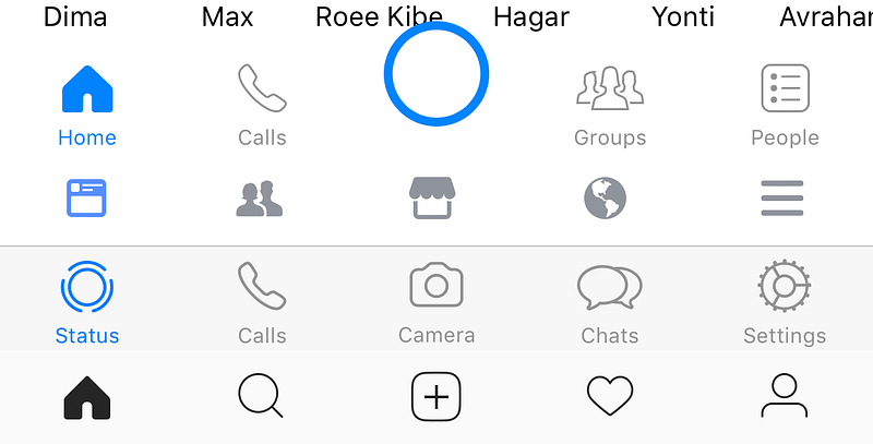
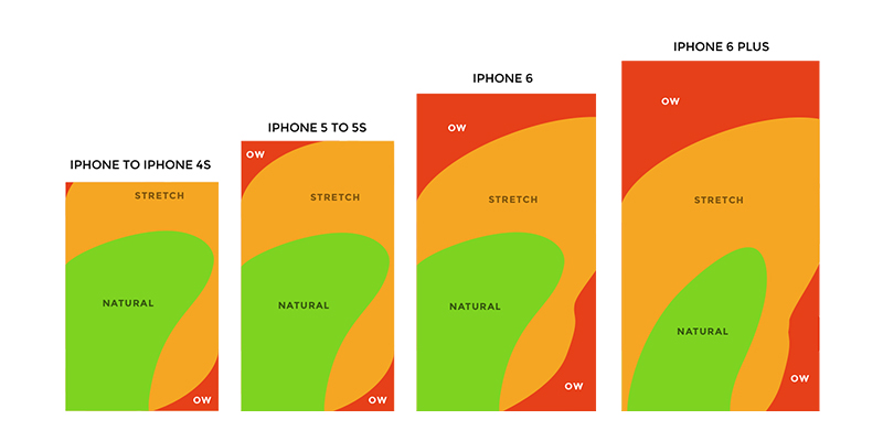
Facebook has mastered making users ignore the bottom middle button; one of the most comfortable navigation areas. Look at the diagram below, it’s evident that no matter which hand holds the phone it would have access to the most important area of the app. Instead they choose to use the bottom navigation for the promotion of their own new features which are far from the main use case.

Mark Zuckerberg said yesterday “You might have noticed all of the cameras that we’ve rolled recently” but didn’t share any usage statistics about them.

Let’s quickly dip into some examples:

Facebook

In Facebook no one looks at the Buy section. This is a total mystery. I wonder who uses it? Seriously I don’t know anyone. Then there’s Facebook Stories, which offers nothing and as far as I’m aware are used by few people, yet they keep insisting on having it there.

The bottom navigation points at a left to right priority. Feed first (main use case), Adding friends (rare case), Marketplace in the most important position (which no one use), Notifications (probably the most used button on them all), Settings.

Instagram

In Instagram people don’t take pictures, they just add pictures they took on their camera app. It’s mainly because in the regular camera you have more options and it’s better to edit and then select from your gallery.

The bottom navigation is similar yet without text subtitles for the icons: Feed (main use case), Explore (quite popular), Take a photo (main thing Facebook whats you to do), Notifications, Settings.

Facebook Messenger

In Messenger no one uses the My Day camera feature.

The bottom navigation has a huge blue button that is laid out uncomfortably on top of your friends’ names and competes with the blue of the active tab. Priority is: Home-Explore + conversations (main use case), Calls (less used feature), Camera (let’s make it big so people use it), Groups (which has its own Facebook app), People (your contacts).

WhatsApp

In WhatsApp no one uses the camera button.

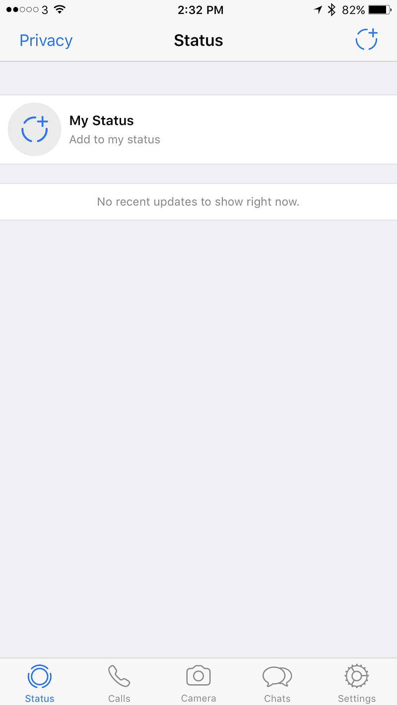
In WhatsApp all of the priorities shifted. Status is not being used by anyone of my contacts, Calls (very popular use case), Camera (no one uses), Chats (main use case), Settings.


What do users want?

For such a huge company it’s embarrassing. It feels as though someone there doesn’t listen to the designers.

Where users really look — http://uk.businessinsider.com/eye-tracking-heatmaps-2014-7?r=US&IR=T

Let’s look at the core purposes of these platforms and my critique

Facebook — What do we use Facebook for? Reading news, asking questions to a community you care about, complaining, raising money, and stalking people you don’t really talk to.

Hence it’s completely not aligned. It seems like Facebook hasn’t decided what its main purpose is, news or people’s lives. It’s ok to try and have both and it kind of worked for a while in the feed, but once there are creation options that are based on both it just gets very confusing.

Messenger / WhatsApp — We use both of these for talking to friends.

Adding the camera is important for an easy way to share images in the chat, but for that button to create a story and have a global chat makes it feel like it’s introducing a new usage for these platforms. People usually talk to individuals or groups, not to everyone, and especially not to every contact they have. There isn’t even a proper way to target specific groups. In the use case of Snapchat the whole experience is extremely curated. You could argue that you can slightly curate in Facebook / Messenger, but in WhatsApp there is zero curation. In which case, who is this feature aimed at? Who realistically is going to use it, and who’s going to engage with the stories they share?

Users mainly look at the middle and it is the easiest area for their fingers to touch on

Instagram — A platform to follow your interests and share your life.

Stories is aligned with the initial purpose of Instagram, allowing people to only share photos they’ve just taken rather than using pre-photographed images. Providing a way for sharing photos from a user’s gallery really changed Instagram and in some ways it allowed professionals to outshine regular users with tools and talent. Stories offer another way of sharing which equalizes the field and has helped bringing back the originality and integrity of the content. However, since Snapchat allows you to upload pre-made video, I suspect all of the Facebook story platforms will allow it in the future, and then again this feature will lose its originality and integrity.

The bottom navigation mess across Facebook’s apps = no consistency + changing hierarchies

Conclusion

I love Facebook and all of their acquired companies. Each one is really good on its own. WhatsApp for the older generation, it’s light and fast. Messenger for a nicer, almost the nicest (second to Telegram) chat experience. Instagram for the amazing creation that keeps happening there. Facebook for the ability to see what my friends care about and participate in groups.

Now there is a something that has been tried in all of these apps without any thought about consistency or the advanced usage of their ecosystem. It’s a shame. The middle button / middle tab was supposed to be one of the main points of focus of the app, the core use case. But Facebook is telling us it’s not. In fact it seems like there is no logic behind the order in which menu items are sorted. Ultimately that diminishes the user experience, making it far from ideal.

The UX Poet


Not too long ago I had an experience that made me look differently on the way I use words. We were holding a workshop with colleagues from Korea and USA. Everything we’ve planned went well and the responses were good. Then we took them for dinner and drinks. A number of beers later, the lead Ux designer of the American team disclosed to me that he thinks I’m using altitudinous words in my presentations. He mentioned that at times they were dazed by the vocabulary. The others agreed and said that they had to go to the dictionary to figure out the exact meaning of a word. We laughed about it. They said I do UX poetry.

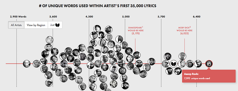
It was a good time to start explaining to my colleagues: “I have a confession, in my past, I used to be a rapper”. Everyone’s like “wow”…to counter all of the trillion preconceptions that just bounced into their head I ask “do you know Aesop Rock?…no…how about Sage Francis, Buck 65…maybe Talib Kweli / Mos Def?” then usually I get one “yes”. That was the kind of hip hop I tried to do.

from the amazing project: poly-graph.co/vocabulary.html

The point is: I’m in love with language, structure, words, rhymes and their meanings. When I was a child I spent hours going through rhyme books, dictionaries, philosophers. I love reading Zizek and going through the same sentence 8 times and maybe get it, or listen to Ghostface Killah and work my way through the slang. I love reading poetry and I also love wowing people with pompous words.

These rappers are less popular. Who reads philosophy nowadays? What does it have to do with UX?

Defining things in UX is crucial. Since the UX discussion is focused on users’ emotions it is eminent to describe it to the best of our ability. Vocabulary shouldn’t be compromised in presentations. The meaning of better communication is to say exactly what you meant and then if needed support it with simpler words.

There must be a parity between an eloquent text and the speaker’s elocution.

Importance of words

It’s never simple to simplify and to find the essence of a “thing”. It’s harder to constrain an emotion into a sentence. When dealing with UX we analyze human behavior and try to use pre-made experiment assumptions and methods to observe and extract meaningful insights. Being able to analyze behaviors require patience and the ability to just facilitate and empathize. Documenting it entails removing preconceptions, ego, and judgmental obstructions. Analyzing it make assumptions rise again through natural comparisons of people for example.

Everything ends up in text or visual format

The process involves dozens of tasks with each of them ending in a written output. The way they will be written and presented will dictate how serious the output will be treated and how will it be absorbed by the rest of team. When it’s all done, written and shared, the creator has to live with it for a while, it’ll turn into a creation condition. These words become the mainstay in which the design ship will be built upon. The definition of the user and the problems will find themselves to the people who are less involved directly. It will be a seed that stays in their head and will grow the business unrestrainedly and unsupervised.

Users are not always right and therefore testing is just the beginning of the process. On top of that experience, a solution is being developed. Every report needs to end with “next steps”. Paragraphs that describe potential solutions should inspire using a vision, maintain simplicity and reveal the road to the target.

Controlling the means of expression means better control of the process.

When reading poetry people’s feelings diverge. I try to create a scenario where everyone has the luxury to think different but eventually it feels the same.

Importance of keywords

Behind every simplicity, there is hidden complexity and the same applies to keywords. Each of them is the key to a passage of information. Eventually, they all end up in the same space, interacting with each other and creating the experience.

Keywords are pillars for the memory of the listeners and if the storytelling and weaving process is done, strong connections can be formed around your designs. A design is not only making per say, it is also communicating. We communicate it to people we present to, people who will read it later, people who don’t have time and will just skim through the pages. When we communicate there are infinite cases to cater and think of.

Be a diplomat when you co-work. Be a poet, strife and ferocious when reaching the conclusion.

UX poetry is your chance to make a difference in a more personal way. Don’t get things diffuse by misunderstandings; write and design the future by any mean of expression, and make it eloquent.

Proving your Design

Over the years I have had more experience working with developers than with designers. However in the past two years I have been more involved with managing and creating design. One of the key goals I had was to structure the processes that would allow me to prove my designs.

Design is not an exact science, but it still has rules. That means that there is a way of creating designs, but no definitive way of knowing in advance whether they will be right for your purposes. I believe that there are tools and processes we can use to increase the probability of designs being fit for purpose and, just as importantly, of convincing others that your design is the right one.

Tools for proving design

Trends

Trends give an overarching view of where people, industry, designers and technology are heading. Trend research usually collates the past two years of an area. All trends start as a seed of inspiration. What you’re doing with your research is tracking the development of that seed to see if it grows into a trend. From the data you gather, you can create a trends report that groups the data in meaningful ways. As well as helping you see where your design fits in current trends, it can also be used to remind stakeholders of things they’ve seen, while reassuring them that you’re considering the wider market and not designing in a vacuum.

Measurements and evaluation

Being patient and focused are rare traits in designers. There is always this drive to change and inspire, to revolutionize to make something interesting again. However, it is extremely important to harness that creativity for critical and incremental development too. Reflecting on your design, testing and measuring it is essential for proving its value to others. To be able to prove a new concept you should measure the previous one, or if it’s completely new, measure it in comparison to other similar concepts.

You can measure design by conducting user testing, focus groups or even guerrilla testing internally. If the measurements to which you test are agreed and respected by the stakeholders it gives your design substantial support.

Experts

To gain credibility for your design you can’t just settle for internet-based research. For example judging a product review on an app has very limited information. Talking to well-known experts will allow you to learn from people who founded the industry and their name can lend credibility to your design, especially if your stakeholders have heard of them. Moreover these experts or advisors cycle through many companies and often have a good sense of what is happening overall. Experts shouldn’t be just design experts, they could be experts in technology, strategy, marketing, or any field relevant to your product.

Benchmarking

Benchmarking is an activity we do naturally all the time. We always compare our product to others and sometimes the grass looks greener on the other side. From my experience it looks greener when we don’t thoroughly understand the strategy or refuse to acknowledge the strengths and weaknesses of our workplace.

Keep a catalog of things that interest you and try to cluster and compare to see improvements and direction. Be mindful of the limitations it imposes on your mind, not everything should be about catching up with competitors. The fact that the market hasn’t done something already doesn’t mean you’ve identified a golden opportunity, it just means that you ought to find the reason it’s not been done already and then see if it matches up with your company’s strategy.

Strategy

Whether you create or rely on strategy, it is always important to understand it and interpret it in a way that will show links between it and your design. Strategy usually relies on knowing the current situation, the goal and how to get there. The change log is very valuable for this purpose –  track your competitors and try to understand their strategy and then use that to your advantage.

History/Company DNA

Looking at the history of your company is extremely important. Know the past to learn for the future. Somewhere there might be a database of useful information about success stories and failures. The faster you understand how the company gained its success, the more quickly you’ll understand if your direction is aligned with theirs. Be mindful of politics; you might present something that has already been tried and rejected by stakeholders.

Co-Design

Designing together helps gain support on the ground and puts the design suggestion under multiple lenses. It is also essential to help you learn more about the company. The more communication and the more knowledge that goes into a design, the better it will be.
Summary

Using these tools is not enough to convince stakeholders though, you’ve got to tell a story. Using these methods could be tricky. You might realize you’ve got the problem right but not the solution, or there might be contradictions between the results you get when testing. When weaved into a compelling story you allow your client to focus on the narrative.

A good designer breaks the product and its context to bits, make sense of them, looks at them through a different lens and then reconstructs the product to make it better.

Communicating that process to stakeholders is important when proving a design. It gives them the why behind the what and often that understanding is what you need to gain support.

Thank you for everyone that helped me and advised me about this post: Carlos Wydler, Oded Ben Yehuda.