Users consume content in a vacuum and it is usually mute. This is a short guide for designing for the mute scroller. How to grab their attention and make sure that your message gets heard…even in mute.
Why mute?
In the Communication Pyramid I mentioned some reasons for mute consumption of content. These reasons are linked to the comfort and discomfort of consuming video. Here are some reasons that relate to sound:
- We don’t like loud unexpected sounds — for example clicking on something and abruptly hearing a loud soundtrack that you never asked for.
- It’s rude — because other people didn’t ask to hear what you want to hear, especially on public transport.
- We are at work and don’t want people to know we are watching videos.
- It’s a standard for most apps.
Every Snap, Instagram story, Facebook video, starts mute. Upon action, the content will come alive with sound. But does it? To be honest, mobile phones’ sound quality is shoddy and since most of today’s consumption is on a mobile phone, why bother? The smart thing would be to ask, where to bother?

Users stop!
All interactions are chained to whether people look at your content. For users to absorb your content you need to make them stop and look at it. In reality, many users will do little more than pause to take a cursory glance at your content before they continue scrolling. There is an average conversion rate of 10% for posts, and 4% in newsletters.
I once tried to put an ad on a Medium post I wrote on Facebook. Here are the stats: 12k Facebook exposures, 900 Clicked through to Medium, 100 read it, I got 0 recommends.

The result

There are many facets to fix to make things better but here I would like to focus on typography and video.
Design for mute
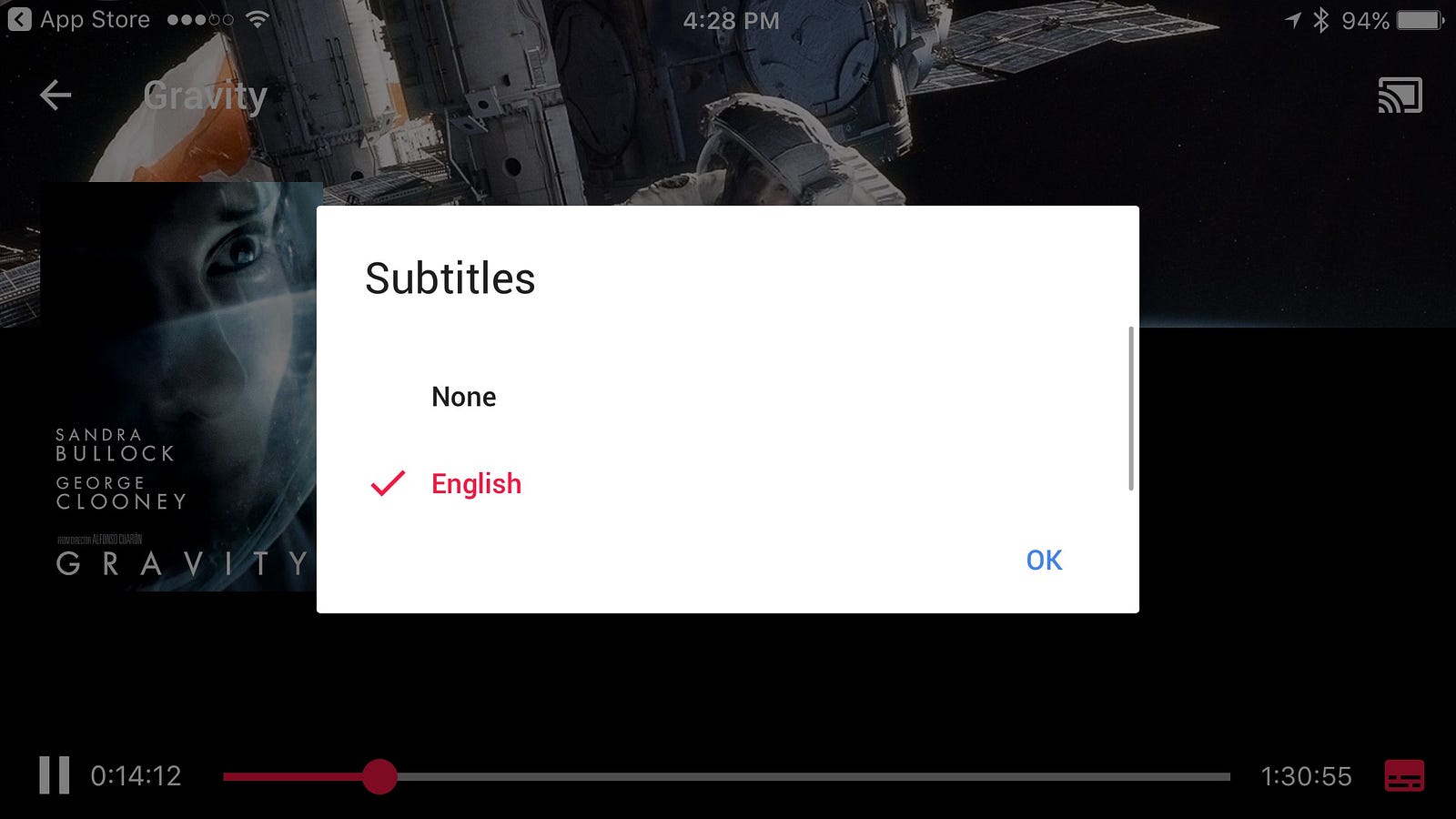
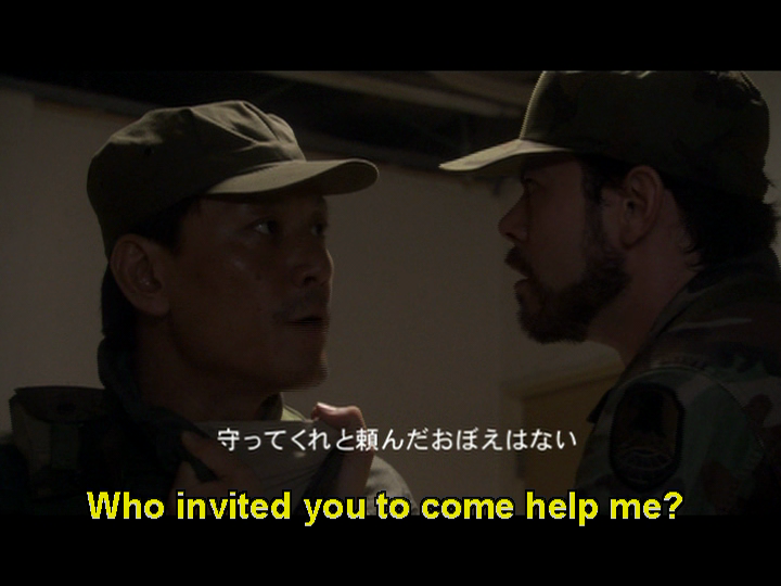
In Subtitles were never designed. The missing element in TV typography design I talked about the importance of subtitles. So here is another good reason to do it. Not every person has a budget to create a mini action movie to make people pause and see his content. Not everyone knows how to produce a show-stopping visual frame.

Imagine you’re walking down the street. How many people will make you turn your head after they pass you? How many will grab your attention? How much of it is positive vs negative attention? How much do you remember from walking down the street? If you stand in the street and look at somebody, what can you guess/know about them?

Well, this is what typography is for. This is why there are street signs. They give you glimpsable visual information. Some places are busier like Tokyo and some are less, like a highway.
So if you are not a movie producer and you’re not hot the alternative is typography and content. This is a way of grabbing attention by highlighting what’s important in the video.

Fast content
A video is the easiest consumption method when users are comfortable. But hey, sometimes users are not comfortable. Sometimes they walk down the street and don’t have time to watch your video, or are just about to get off a bus. So hit it as hard as possible from the very beginning.
Editing is extremely important. The ability to let the observer see the music and imagine how it sounds is the essence of editing. For the mute scroller, it might give them a reason to stop.
Here is an example of a new channel in Israel that shows great editing and can also be seen in mute.
Design for sync
Video content pieces just stream. It gives users the feeling of missing out (if done well). But in some cases, it takes users some time to make a decision along the lines of: “It looks interesting, I actually want to hear what this person is speaking about”. If you use typography syncing the user in would be smooth. The user will be informed because he can read what it’s about, and now he can just continue experiencing it.
Typography is not just static. We want to share a feeling and draw users in, which means we need to trigger the right mood. The way the text animates informs the user if it’s a sad/angry/happy story. Nowadays I wouldn’t post any video without subtitles that are matched for the platform in terms of size. But to enhance it further you need to look to the areas of pace, color and size, where much more can be done.
A Facebook example
Facebook recognized this and helped users create these gradients with text. The reason that people turned away from writing is because they believed users would always look at a video or an image, it’s bigger and better at grabbing attention. I think it was a smart decision by Facebook because it works, especially when mute scrolling. People stop and read — if it’s not too many words.

Breathe…
I’m a sound lover and I would love to see a platform that can give me the Facebook feed in audio only. All of these quick consumption platforms are in the business of mini-boredom. They just fill up the empty pieces of our lives. Instead of gaining observation and sociability, we consume isolated from our surroundings. The good thing about sound is that it’s not fully taking over, it’s a secondary sense that enhances your reality rather than replacing it. It comes together and doesn’t take over.
I can’t wait for a world where everyone has an implant in their ear which gives them added information. Personally, I see it as more valuable than AR or VR. I know it’ll be less exciting and grandiose. But it’ll be more intimate, human, and helpful. In any case, I know the future will be exciting, escorted by voices in our heads. In the meantime, we’ll keep on scrolling.