Where will ads live? The answer: Hardware

There are countless businesses that build their value on the back of ads. Shamefully it became the default reaction to “what’s your business model? Advertising”. Because of this, ads became more hated than ever. Yet there is barely any supervision for the content that is in ads. With the absence of supervision in this space there is a major opportunity: To grab the last touch point, and make it useful and workable for the customer. Let’s dive in.

Trust the medium?

Newspapers are a medium, a format that ads are distributed through. As well as charging companies to place adverts, consumers paid to read the papers, and therefore to see the adverts. Before the rise of the internet, the monopoly over information that people wanted to read made it feasible to charge the two sides of the market, the customer and the advertiser. Newspapers were better the more distribution they had.

As power accumulated so did money. Norms started appearing, and with them a code of conduct. Many of the people who worked in the information business were creatives. For example: journalists, editors, and photographers. This led to the creation of unions, enforcing the code of conduct and ethics. People ended up buying the newspaper for its name which symbolized some sort of truth. Authors were relentless in their pursuit of the truth while telling a good story. Today most people don’t know where an article came from “I just saw it on Facebook”, let alone who wrote it.

People spend less writing time per article today in comparison to the past. Articles are distributed through undifferentiated platforms and mutate according to the platform. Likes are dismissive, comments are mostly superficial – three words or an emoji. Mini boredom is solved by minimal non-obligatory interactions and people have short attention spans.

Ads kept their place in this world, dollars follow attention and distribution, not ethics. Ads moved where the information did; after all, ads are also some sort of information that someone wants to provide. An ad’s trustworthiness is created by grabbing attention and using public / attractive figures. These address the truth or utopia, whims of dreams.

Trust the distributors?

It is always said that when you control the distribution you can control the knowledge. Only in the past there were more layers to filter ads, based on the content that editors wanted to correlate with their brand and standards. But a paradigm shift happened, the choice now belongs to the people. Your friends can post whatever they want to and companies can target whoever they feel like. Because of scale, there is less of a critical eye being cast over what is exposed to the public.

The other day a friend of mine wanted to publish a campaign on Instagram. He filmed his music studio, but upon uploading it the Instagram algorithm claimed that text appeared in his video, thus blocking the campaign. In response, he requested that they look at it manually because it, in fact, didn’t include any text. A few days passed and they approved the campaign. AI is not smart enough to even determine whether there is text in a video, I don’t expect it to judge the content anytime soon.

Big money was always in the game. Many newspapers and media companies are owned by political bodies. That’s exactly the reason that today if you pick up The Guardian you know what to expect, and the same is true if you watch Fox News. Most platforms don’t have anyone editorial, or legal, looking at anything that comes online. Until recently nobody was interested in standardizing ads, their content or their mechanism.

Trust today’s solutions?

Throughout history, many people have tried to avoid specific types of content, ads among them. One of the key marketed benefits of having a remote control was to skip a channel when ads are on TV. When VCRs arrived people recorded shows and fast-forwarded ads. People loved the concept of controlling the content. Today cord cutters also prefer it to cable TV because they want to see what they want to see without ads. In fact they care less about where the content came from, and are more interested in just consuming it.

As an example, Netflix built on the lack of care shown by customers and so did cable companies. But now TV companies try to differentiate themselves because they do care about exclusivity, and therefore want to create a lockdown mechanism. Once it is strong enough, I believe that even paying customers will see ads again.

2016 was a big year for Ad Blockers. As the number of people who installed an Ad Blocker rose above 20% the advertising industry and the distributors realised it’s a big problem. The reactions varied:

  1. Block every user that has Ad Blocker from watching any content
  2. Make a paywall for content without ads and give away some content for free
  3. Show parts of the content
  4. Beg for users to remove their Ad Blocker
  5. Say they ethically request users to remove it so they (the distributor, content maker) can support themselves.

But only halfway through the year, new voices arose calling for ads to be standardized. These voices looked at the problem at hand. With today’s accurate tracking and personalization, why would people block ads? The answer is that ads are a jungle full of clickbait ads, spam, viruses, ads that hurt the user experience and take over the whole screen, ads that play sudden loud music or open unwanted windows, the list goes on.  So they decided to try and work on standardizing ads, and at some point, they will have some teeth. But in the meantime…

People discovered Ad Blockers and even if there were some ads they didn’t mind seeing, they just wanted to get rid of it all completely because the bad and interruptive ads outweighed the good and targeted ads. Ad Blocker was such a hit that it caught both Apple and Google’s attention. We can already see seeds of their work in updates they did recently.

Apple’s cookie tracking blocker mechanism in IOS 11’s Safari has reportedly cost media companies around 200 million dollars. Google is bringing an integrated ad blocker to Chrome. Probably to block everyone else’s ads and prioritize their own. They are both trying to prevent users from choosing services like adBlocker Plus.

This kind of service makes its money by allowing specific ads to go through the filter. This allows them to get paid, it’s their business model. Do we trust Google more than we trust adBlocker Plus? I really don’t know, but it seems like it’s a good idea to be able to avoid a monopoly on this front. It seems that the EU is also eying this area.


Who to trust?

Privacy and ads seem to be an especially good opportunity for aggregators that have a leg in the hardware world. Why? Because hardware is the actual touch point for the customer. You could argue that you watch Netflix on TV but I would argue that you watch TV!

For many years hardware companies took the wrong steps to catch up with startups and software companies. Among these wrong steps, we have the cases of bloatware (adding unnecessary apps to your phone, hoping that you will use them), and creating competing software that wasn’t good or innovative enough etc. But now it seems companies like Apple and Amazon understand that they will never have a better app than a competitor that is working on it exclusively. By becoming a smart aggregator, and applying regulations and ethics, the last touch point can become the only touch point.

Here are a few examples:

Apple pulling out an app from the app store because it’s competing with a service they are about to launch, or inappropriately using one of their devices.

Apple’s TV app aggregates TV shows and movies from all the apps that are installed on the Apple TV. If you add Apple’s future original content it’s a very powerful touch point.

Amazon creating an API for developers to use Alexa, controlling what information they give to developers.

Facebook’s single sign in, which allows users to signup and protect their information to a certain extent.


It is essential for hardware companies to know what’s going on within each app that is on their devices. Of course Facebook will never agree to give Google all its info about what you do on your device. But in reality, Google look at what you type on your keyboard, and they also know how long you spend in the app. That is already very valuable information.

Imagine you are watching a TV show on live TV and when the ads start the TV blocks them, or changes the channel to something else (your second option) until the ads end. Imagine the TV making sure you watch an ad that is relevant to you, like on the internet. Instead of watching a tampon ad you’ll see a PlayStation game ad. Imagine physical ads on the street that will react to your profile.

I believe that this is the future that companies like Google, Apple, Amazon and Facebook imagine. A future where controlling the touch point allows them to set rules that will make the user experience better, that will target us personally with things that interest us (or that will affect us – depending on how dark we want to be). The company that controls the last step of the interaction, the physical touch point, is the company that can call the shots. This is one of the main reasons why every big software firm tries to branch out into hardware.

When a user is using your software the user is your product. You will do anything in your power to retain them and you will make money out of them however you can (ads, upgrades etc.). When a user buys your device the user is your customer and the device is your product. You will do everything you can to make your device better. Thus you will want them to have the best experience possible. Ads wouldn’t interest you because it’s not how you’d make money. You’d make money by selling your device and creating the best experience. And that wouldn’t include ads, unless you are a newspaper 🙂

Goodbye Stereo, hello 360º Sound

In the past five years, there has been a paradigm shift in the speakers market. We’ve started seeing a different form factor of audio capable devices, 360-degree audio speakers, emerging. I want to have a look at the reasons behind the appearance of this form factor and the benefits it brings us.

First, it is important to look at the market segmentation reasoning:

1. Since the inclusion of Bluetooth in phones there has been a variety of (mainly cheap, initially) speakers that sought to abolish the need for cables. Docs and Bluetooth speakers were the answer. But at the time there was no premium solution for Bluetooth speakers and besides sound quality, there was room for more innovation (or gimmicks, like a floating speaker). To luxuriate the Bluetooth speaker one of the solutions that were created was a 360° speaker.

The original Bluetooth speakers were directional speakers and since it is unknown where they will be placed, how many people need to listen to them and where they are sitting; having a directional speaker is a disadvantage in comparison to a 360° one.

2. From another perspective, 360° speakers function as a cheaper alternative to hi-fi audio systems. Many customers are just interested in listening to music in their home in comfort and do not require a whole setup with wires and receivers. They also mainly play music using their mobile phones.


So it fits right in the middle. Now let’s look at some use cases:

Parties — It can be connected to other speakers and have increased sound. It’s also relatively easy for other people to connect to it.

Multi-room — It can allow you to play music whilst controlling it with your phone in all sections of your house. It can also be controlled remotely.

Conference calls — or actually any call. It’s also possible to put it on speaker on your phone but that’s sometimes hard to hear.

Smart — Today we have assistant speakers with arrays of microphones that sometimes come in the form of 360. It’s a bit different but a 360° microphone array is as useful as a speaker array.

I want to focus on the 360° form factor and discuss why it is so important and a real differentiator. To be able to understand more about 360° audio, its advantages and the future of 360° audio consumption, it is important to have a look at the history of sound systems.


The person as sound — Before there were speakers there were instruments. People used their own resonance to make a sound and then found resonance in drums, and string-based instruments. That led to a very close and personal interaction which could be mobile as well. People gathered around a singer or musician to hear them.

Phonograph and Gramophone — This was the first time music became reproducible mechanically. However, it was still mono (one channel). From an interaction perspective, it was a centerpiece with the sound coming out of the horn.

Stereo systems — Stereo was an ‘easy sell’, after all we all have two ears. Therefore speakers that can pleasure them both are fabulous. Some televisions were equipped with mono speakers but more advanced televisions had stereo speakers too.

Surround — 3/5/7.1 systems were introduced mainly for the use case of watching movies in an immersive way. These systems included front, back, center, and sub speakers (sometimes even top and bottom). It is still quite rare to find music recordings that are made for surround. Algorithms were also created for headphones, to mimic surround.

But there is a limitation with these systems. Let’s compare it to the first two reproducible sound systems: the human voice and the Phonograph. They both had more mobility. You could place them wherever you wanted to and people would gather around and listen to music. I can’t say it’s exactly the same experience, but it doesn’t hurt the premise of the instrument. However, with stereo systems and surround systems, you need to sit in a specific contained environment in a specific way to really enjoy their benefits. Sitting in a place where you cannot really sense that spatial experience makes these systems redundant.

Sources of music

Audio speakers in the present

Considering current technologies and their usage, our main music source is our mobile phones. It’s a music source that doesn’t have to be physically connected via cables. Our listening experience is more like a restaurant experience where it’s not important where the audio is coming from as long as it’s immersive. 360° speakers then were able to provide exactly that with fewer speakers. But we lost something along the way, we lost stereo and surround. In other words, we lost the immersive elements of spatial sound.

Audio speakers in the near future

There are huge investments in VR, AR and AI and all of these fields are affecting sound and speakers. In VR and AR we are immersed visually and auditory, currently using a headset and headphones. At home we’ve started controlling it via our voices, turning lights on and off, changing music and so on.

Apple’s HomePod has a huge premise in this respect. Its spatial algorithm could be the basis for incredible audio developments. Apple might have been late to the 360° market but they have tremendous experience in audio and computing and this is why I think this is the next big audio trend: “The spatially aware 360° speaker”.

From Apple’s presentation

Although they sell it as one speaker it can obviously be bought in pairs or more. The way these understand each other will be the key to this technology.

Spatiality is important because in a 360° speaker a lot of sound goes to waste, and a lot of power is inefficient. Some of that sound is being pushed against a wall which causes too much reverb. Most of the high frequency that is not being projected at you is useless.

Here are the elements to take into account

  1. Location in the room — near a wall, in the corner, center?
  2. Where is the listener?
  3. How many listeners are there?
  4. Are there other speakers and where?

In Apple’s demonstration, it seems that some of these are being addressed. It’s clear to see that they thought about these use-cases and therefore embedded their chip into the speaker which might become better over time.

The new surround

360° speakers can already simulate 3D depending on the array of speakers that are inside the hardware shell. This will be reflected in the ability to hear stereo if you position yourself in the right place.

But things get much more interesting if the speaker/s are aware of your location. If you are wearing a VR headset and have two 360° speakers you can potentially walk around the room and have a complete surround experience. A game’s experience could be super immersive without the need for headphones. Projected into AR, a room could facilitate more than one person at a time.

Consider where music is being listened to. In most instances, a 360° speaker would be of greater benefit than a stereo system. In cars, which usually have four speakers, offices and clubs, 360° speakers would work better than a stereo system. Even headphones could be improved by using spatial awareness to block noises from the surrounding environment and featuring a compass to communicate your orientation. Even a TV experience can be upgraded with just HomePods and some software advancements.

What about products like Amazon Echo Show?

A screen is a classic one direction interaction. Until we have 360-degree screens which work like a crystal ball with 360° audio, I don’t see it becoming the next big thing; after all, we still have our phones and tablets.

The future of 360 in relation to creation and consumption tools

Here are a bunch of hopes and assumptions:

  1. Music production and software will adopt 360° workflows to support the film and gaming industry; similar to 3D programs like Unity, Cinema 4D, and Adobe.
From Dolby Atmos

2. New microphones will arise, ones that record an environment using three or more microphones. It will initially start with a way to reproduce 3D from two microphones, like field recorders, but quickly it’ll move into more advanced instruments driven by mobile phones which will adopt three to four microphones per phone to be able to record 360° videos with 360° sound. Obviously, it’ll be reflected in 360° cameras individually as well.

3. A new file type that can encode multiple audio channels will emerge and it will have a way of translating it to stereo and headphones.


I can’t wait to see this becoming reality and having a spatially aware auditory and visual future based on augmented reality, using instruments like speakers or headphones and smart glasses to consume it all.

Here are a couple of companies/articles that I think are related

Designed for the mute scroller

Users consume content in a vacuum and it is usually mute. This is a short guide for designing for the mute scroller. How to grab their attention and make sure that your message gets heard…even in mute.

Why mute?

In the Communication Pyramid I mentioned some reasons for mute consumption of content. These reasons are linked to the comfort and discomfort of consuming video. Here are some reasons that relate to sound:

  • We don’t like loud unexpected sounds — for example clicking on something and abruptly hearing a loud soundtrack that you never asked for.
  • It’s rude — because other people didn’t ask to hear what you want to hear, especially on public transport.
  • We are at work and don’t want people to know we are watching videos.
  • It’s a standard for most apps.

Every Snap, Instagram story, Facebook video, starts mute. Upon action, the content will come alive with sound. But does it? To be honest, mobile phones’ sound quality is shoddy and since most of today’s consumption is on a mobile phone, why bother? The smart thing would be to ask, where to bother?

An incentive to click on the video. The post tells us what it’s about and what we are about to hear if we click it.

Users stop!

All interactions are chained to whether people look at your content. For users to absorb your content you need to make them stop and look at it. In reality, many users will do little more than pause to take a cursory glance at your content before they continue scrolling. There is an average conversion rate of 10% for posts, and 4% in newsletters.

I once tried to put an ad on a Medium post I wrote on Facebook. Here are the stats: 12k Facebook exposures, 900 Clicked through to Medium, 100 read it, I got 0 recommends.

The result

There are many facets to fix to make things better but here I would like to focus on typography and video.

Design for mute

In Subtitles were never designed. The missing element in TV typography design I talked about the importance of subtitles. So here is another good reason to do it. Not every person has a budget to create a mini action movie to make people pause and see his content. Not everyone knows how to produce a show-stopping visual frame.

Imagine you’re walking down the street. How many people will make you turn your head after they pass you? How many will grab your attention? How much of it is positive vs negative attention? How much do you remember from walking down the street? If you stand in the street and look at somebody, what can you guess/know about them?

yeah you are angry, but what are you talking about? I don’t know and I probably missed half of it by the time I pressed play. But yeah I’d stop down the street and look at this guy!

Well, this is what typography is for. This is why there are street signs. They give you glimpsable visual information. Some places are busier like Tokyo and some are less, like a highway.

So if you are not a movie producer and you’re not hot the alternative is typography and content. This is a way of grabbing attention by highlighting what’s important in the video.

Good use of subtitles in the French elections

Fast content

A video is the easiest consumption method when users are comfortable. But hey, sometimes users are not comfortable. Sometimes they walk down the street and don’t have time to watch your video, or are just about to get off a bus. So hit it as hard as possible from the very beginning.

Editing is extremely important. The ability to let the observer see the music and imagine how it sounds is the essence of editing. For the mute scroller, it might give them a reason to stop.

Here is an example of a new channel in Israel that shows great editing and can also be seen in mute.


Design for sync

Video content pieces just stream. It gives users the feeling of missing out (if done well). But in some cases, it takes users some time to make a decision along the lines of: “It looks interesting, I actually want to hear what this person is speaking about”. If you use typography syncing the user in would be smooth. The user will be informed because he can read what it’s about, and now he can just continue experiencing it.

Typography is not just static. We want to share a feeling and draw users in, which means we need to trigger the right mood. The way the text animates informs the user if it’s a sad/angry/happy story. Nowadays I wouldn’t post any video without subtitles that are matched for the platform in terms of size. But to enhance it further you need to look to the areas of pace, color and size, where much more can be done.

A Facebook example

Facebook recognized this and helped users create these gradients with text. The reason that people turned away from writing is because they believed users would always look at a video or an image, it’s bigger and better at grabbing attention. I think it was a smart decision by Facebook because it works, especially when mute scrolling. People stop and read — if it’s not too many words.

Breathe…

I’m a sound lover and I would love to see a platform that can give me the Facebook feed in audio only. All of these quick consumption platforms are in the business of mini-boredom. They just fill up the empty pieces of our lives. Instead of gaining observation and sociability, we consume isolated from our surroundings. The good thing about sound is that it’s not fully taking over, it’s a secondary sense that enhances your reality rather than replacing it. It comes together and doesn’t take over.

I can’t wait for a world where everyone has an implant in their ear which gives them added information. Personally, I see it as more valuable than AR or VR. I know it’ll be less exciting and grandiose. But it’ll be more intimate, human, and helpful. In any case, I know the future will be exciting, escorted by voices in our heads. In the meantime, we’ll keep on scrolling.

The slipperiness of UX data

In my article proving design, I talked about how hard it is to have proofs for making the right product or product decisions. Some projects are so expensive that it takes a lot of convincing to get a budget for them. It’s a natural trade-off. It doesn’t get easier after you’ve done parts of the project, or even after you’ve done the project and are now interested in moving forward with a second stage of development.

Many UX professionals talk about the importance of data but let’s be honest, in the cycle of design and decision making there are countless things that cannot be measured.

What can be measured?

  1. Do people need your product?
  2. The product itself and how people use it.
  3. Ideas, and iterations — Using user research.

Basically everything you can do with your team. It adds up to around 20% of the creation process.

What do you create? What informs your ideas? Are you influenced by other designs you can’t measure? Hell yeah!

What cannot be measured?

Competitors

You can’t know why your competitors behaved the way they did. You don’t have their data and you can’t know their decision-making process.

Pre-product behavior

There are many marketing products that are trying to solve this. However, in this part of the user journey, the designers have zero control. The user journey is driven by the facilitators whether it’s the OS or the platform. Each platform will supply you with some data and measurements but it’s not exactly monitoring UX, it’s more generic and marketing led. In big organizations, it’ll also be a challenge to get these data points. In addition, every piece of data should be verified. With platforms, it’s almost impossible to verify.

Analytics

In your service, you’ll need to check and correlate through different tools (MixPanel, GTM, Data studio, etc.). Understanding analytics tools have become essential for UX and Product roles. This is how companies make crucial decisions and that’s why it is checked and cross matched, usually with three to four systems, to compare and see if the data is reliable.

OS design patterns

The fact that Google decided something should look the way it does doesn’t mean it’s the best way. It means that they probably measured it and it works. It also means that with their level of influence, many apps will adopt it and it’ll become familiar. But it doesn’t necessarily mean it’s better. Some of these decisions are made to differentiate from other platforms like iOS or Windows. Other decisions are a compromised solution to a great design because the design might be patented. That’s precisely why Google and Microsoft bought Motorola and Nokia, stripped them of their patents, and then sold them on to someone else. So if you’ve seen a design, even if it’s famous, it doesn’t mean it’s the best practice.

Just because it works it doesn’t mean it’s a nice experience. Many companies don’t see a reason to change. It’s very common when a company has a monopoly.. For example buying stuff on eBay…does it work?, Yeah…Is it a nice experience? No. Everything is cumbersome: receiving messages, sending, going through versions of eBay from 2000 till today.

It works but it ain’t nice and at times very confusing

In comparison, Amazon are more ambitious and “very slowly” redesign their experiences to be functional and delightful.

You’ve got the Data! But, wait, it might be skewed.

Let’s have a look at how this can happen.

Wrong implementation

Just a simple line of code or a selection of a wrong event could cause every click to be counted as two. That’s why it’s important to check with multiple systems — which, as I mentioned earlier, could be problematic at the stage prior to the user journey beginning in earnest.

Intentions

Even if you have a lot of verified data, how can you believe the data that you see? Every person that collects data (arguably even scientists) is trying to show the data in a way that will flatter their agenda. Data can be collected and presented in a non-neutral way. It’s natural and happens with everyone from marketing companies to UX designers who just want their projects to be successful.

Source giphy.com

Presentation

The medium is the weapon and it’s important to understand why something was chosen, in a similar way to understanding graphic design decisions: What do they show me, and what don’t they show me.

A few current examples of skewed data and how it has been used:

  1. Facebook admitted to having wrong measurements for the 10th time
  2. Facebook is accused of being part of the Fake news problem…Google is too, but it’s used much less for leisure and content consumption.
  3. Facebook is deleting tens of thousands of Fake users, which is why they keep tweaking the news feed, and Google is doing the same with search results.
  4. Cambridge Analytica is suspected of and grilled about their methods for influencing users in the UK / US.

Key ways to deal with it

Critic

Be harsh and critical, try to look for the angle. Life sucks if you always think everyone has an interest but even though awareness drives sadness it’s smarter to look at things critically, especially in business. So when you see a new feature, after you finish getting excited or booing it, think about why they created it? Whose decision was it to make it and what’s their interest? Link its value to the business, marketing, user satisfaction, design etc. Guess which department came up with this concept. Think about where they could take it to next. What’s the future of it?

Influenced but aware

There is nothing public, what you have is a trail of user experience data. I got responses for a previous post I wrote about Facebook that said: “But where is the data?” The answer is: This data is internal and not available to anyone else. It’s too secretive to expose, it’s their secret sauce. Does that mean I’m not allowed to write about or analyze it? I don’t think so.

In Instagram, you’d know how many pictures are uploaded to Instagram because it’s a financial data that affects retention/time spent. But you wouldn’t know how many of these pictures are uploaded from a computer, user’s gallery or a professional camera. It’s just important to accept it when critiquing or being influenced by it and to know the limitations of the data you’re dealing with.

Here is an example where you have data, but can only see part of the picturee: “Apple’s revenue from repair is bundled in with its “services” revenue, alongside digital content sales, AppleCare, and Apple Pay revenue. While there is no good way to figure out how much revenue comes from repair, Apple’s services revenue pulled down $7.04 billion in net sales, out of $52.90 billion total.”

Hack

Be aware of your level of control, but see if you can take it further. The difference between owning an OS and participating in one is huge. When I was working for Samsung we were designing the core of Tizen OS for TV. We had control over everything without limitations. We could track everything we wanted to if we built it. But when you are a part of an ecosystem you need to play by the rules and get whatever you can throughout the process. That’s why designing for a native OS is such fun, especially if others are building and increasing your knowledge.


Data is important, but I would argue that decision making can only be done based on it to a certain degree. In my opinion, around 70% of what constructs the decision is experience, aspirations, and alignment with the other sides of the business. A good designer or product guy should influence and convince but it’s not all up to data. Data is just another tool in the arsenal and it’s good for specific use.

Facebook’s UX is killing the “home” button

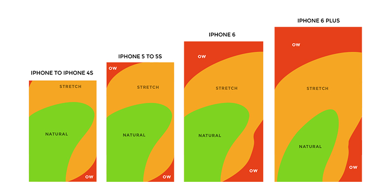
Facebook has mastered making users ignore the bottom middle button; one of the most comfortable navigation areas. Look at the diagram below, it’s evident that no matter which hand holds the phone it would have access to the most important area of the app. Instead they choose to use the bottom navigation for the promotion of their own new features which are far from the main use case.

Mark Zuckerberg said yesterday “You might have noticed all of the cameras that we’ve rolled recently” but didn’t share any usage statistics about them.

Let’s quickly dip into some examples:

Facebook

In Facebook no one looks at the Buy section. This is a total mystery. I wonder who uses it? Seriously I don’t know anyone. Then there’s Facebook Stories, which offers nothing and as far as I’m aware are used by few people, yet they keep insisting on having it there.

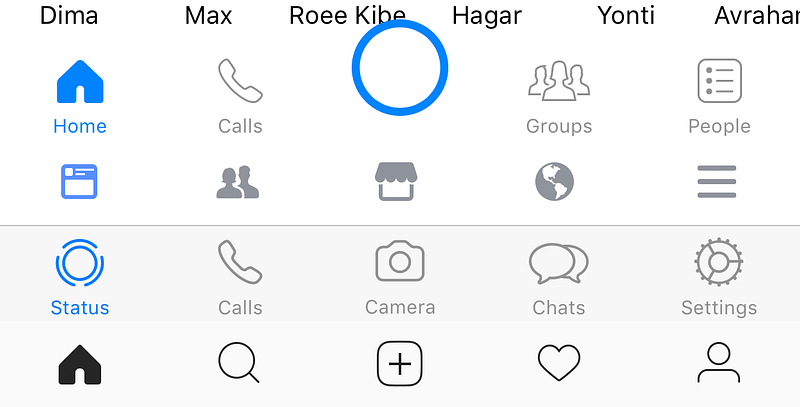
The bottom navigation points at a left to right priority. Feed first (main use case), Adding friends (rare case), Marketplace in the most important position (which no one use), Notifications (probably the most used button on them all), Settings.

Instagram

In Instagram people don’t take pictures, they just add pictures they took on their camera app. It’s mainly because in the regular camera you have more options and it’s better to edit and then select from your gallery.

The bottom navigation is similar yet without text subtitles for the icons: Feed (main use case), Explore (quite popular), Take a photo (main thing Facebook whats you to do), Notifications, Settings.

Facebook Messenger

In Messenger no one uses the My Day camera feature.

The bottom navigation has a huge blue button that is laid out uncomfortably on top of your friends’ names and competes with the blue of the active tab. Priority is: Home-Explore + conversations (main use case), Calls (less used feature), Camera (let’s make it big so people use it), Groups (which has its own Facebook app), People (your contacts).

WhatsApp

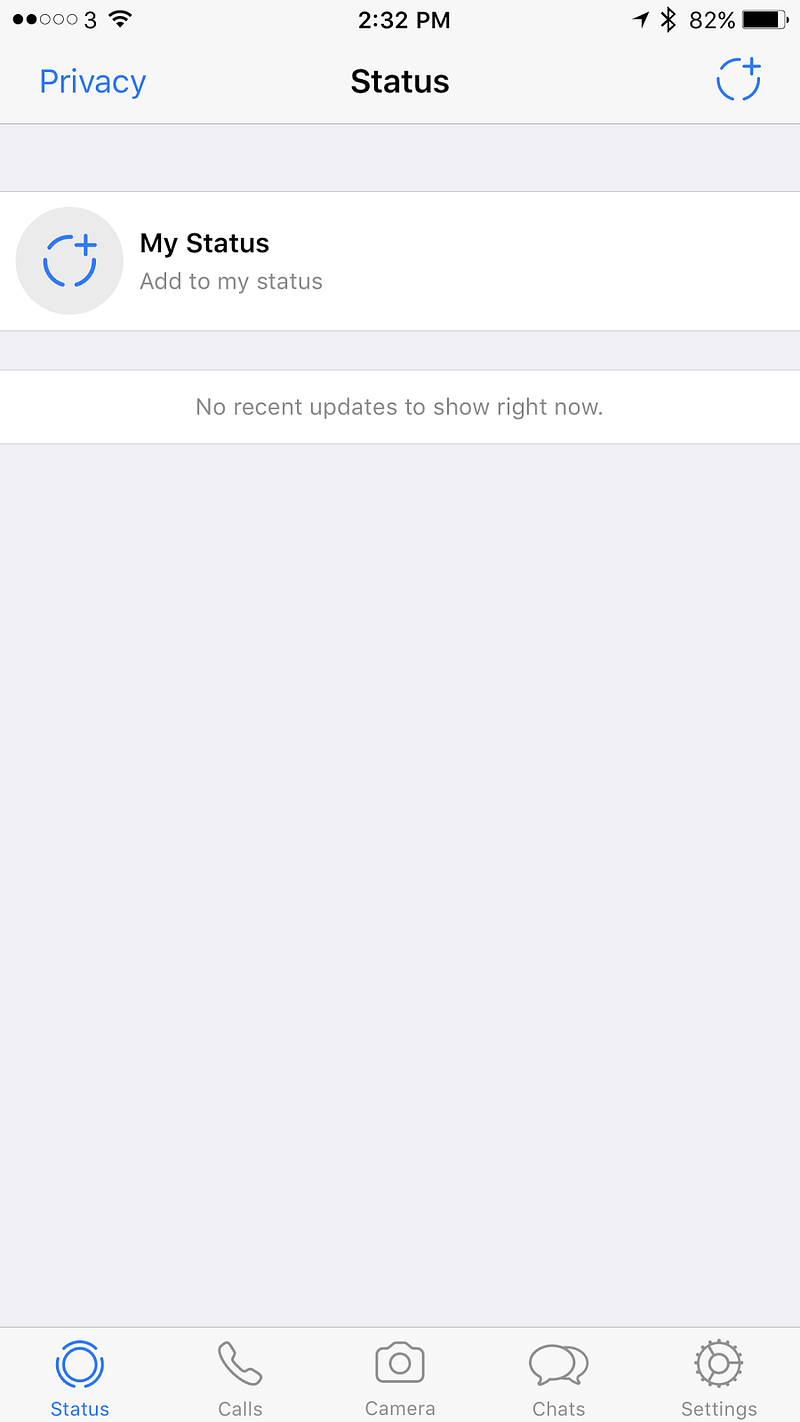
In WhatsApp no one uses the camera button.

In WhatsApp all of the priorities shifted. Status is not being used by anyone of my contacts, Calls (very popular use case), Camera (no one uses), Chats (main use case), Settings.


What do users want?

For such a huge company it’s embarrassing. It feels as though someone there doesn’t listen to the designers.

Where users really look — http://uk.businessinsider.com/eye-tracking-heatmaps-2014-7?r=US&IR=T

Let’s look at the core purposes of these platforms and my critique

Facebook — What do we use Facebook for? Reading news, asking questions to a community you care about, complaining, raising money, and stalking people you don’t really talk to.

Hence it’s completely not aligned. It seems like Facebook hasn’t decided what its main purpose is, news or people’s lives. It’s ok to try and have both and it kind of worked for a while in the feed, but once there are creation options that are based on both it just gets very confusing.

Messenger / WhatsApp — We use both of these for talking to friends.

Adding the camera is important for an easy way to share images in the chat, but for that button to create a story and have a global chat makes it feel like it’s introducing a new usage for these platforms. People usually talk to individuals or groups, not to everyone, and especially not to every contact they have. There isn’t even a proper way to target specific groups. In the use case of Snapchat the whole experience is extremely curated. You could argue that you can slightly curate in Facebook / Messenger, but in WhatsApp there is zero curation. In which case, who is this feature aimed at? Who realistically is going to use it, and who’s going to engage with the stories they share?

Users mainly look at the middle and it is the easiest area for their fingers to touch on

Instagram — A platform to follow your interests and share your life.

Stories is aligned with the initial purpose of Instagram, allowing people to only share photos they’ve just taken rather than using pre-photographed images. Providing a way for sharing photos from a user’s gallery really changed Instagram and in some ways it allowed professionals to outshine regular users with tools and talent. Stories offer another way of sharing which equalizes the field and has helped bringing back the originality and integrity of the content. However, since Snapchat allows you to upload pre-made video, I suspect all of the Facebook story platforms will allow it in the future, and then again this feature will lose its originality and integrity.

The bottom navigation mess across Facebook’s apps = no consistency + changing hierarchies

Conclusion

I love Facebook and all of their acquired companies. Each one is really good on its own. WhatsApp for the older generation, it’s light and fast. Messenger for a nicer, almost the nicest (second to Telegram) chat experience. Instagram for the amazing creation that keeps happening there. Facebook for the ability to see what my friends care about and participate in groups.

Now there is a something that has been tried in all of these apps without any thought about consistency or the advanced usage of their ecosystem. It’s a shame. The middle button / middle tab was supposed to be one of the main points of focus of the app, the core use case. But Facebook is telling us it’s not. In fact it seems like there is no logic behind the order in which menu items are sorted. Ultimately that diminishes the user experience, making it far from ideal.

Finished copying Snapchat? What’s next in messaging

In the past year we’ve seen more copying than innovation in the world of messaging. In 2016 everyone did stories, disappearing messages etc. Instead of simply trying to mimic Snapchat there are other useful avenues to explore that can simplify people’s lives and increase engagement. In this article I will analyze key areas in the world of digital conversation and suggest practical examples of how it could be done.

What should be enhanced in messaging:

As users we spend most of our screen time communicating. Therefore there is a need for it to be easy and comfortable; every tap counts.

Part 1

Comfort — The product needs to be easy to adopt, following familiar patterns from real life and aggrandize them.

Rich messaging — Introducing new experiences that help users articulate themselves in unique ways. Charge the conversation with their personality.

Part 2

Automation — Reducing clutter and simplifying paths for repeated actions.

Control — A way for users to feel comfortable; to share more without proliferating vulnerability.

Rich messaging

Being rich in a wider sense means you have a variety of options and most of them are cheap for you. In a messaging UX context, cheap means content that is easy to create; interaction that helps deliver and sharpen the communication. Rich messaging can be embodied in the input and output. It is catered to the user’s context thus facilitating ongoing communication and increasing engagement.

In the past, and currently in third world countries, the inability to send large files including voice messages resulted in many people simply texting. This led more people to learn to read and write. Unapologetically text is harder to communicate with and primitive in terms of technology, hence why users have come to expect more.

Take voice input/output for example. It’s the perfect candidate as there is increasing investment in this area. Speaking is easy, in fact using sounds is the easiest way for humans to assimilate and share information.

There are scenarios where voice can be the preferred communication method, such as when you’re driving, when you’re alone in the room, when you’re cooking, and when you’re doing anything that keeps you relatively busy.

Here are a few examples for rich messaging:

Voice to text — Messaging is asynchronous and to drive engagement the goal is to strive for synchronous. It doesn’t matter how the content was created. What matters is that it is delivered to the other person in a form they can consume now!

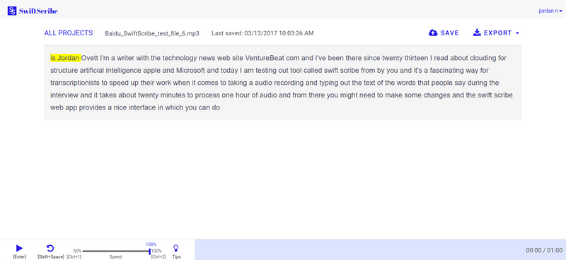
Voice dictation has improved tremendously but somehow most of the focus has been on real-time. The nature of messaging dictates a non-real-time solution. It can be leveraged to give a better quality LPM (Language Processing Model) transcript result. For example, Baidu recently launched SwiftScribe which allows users to upload an audio file that the program transcribes.

Another recent example is Jot Engine, a paid service designed withinterviews in mind. I myself use Unmo and PitchPal to help me prepare for pitches.

They’re not perfect but they take away the guesswork of trying to understand someone in real-time. In a recording, the algorithm can search for context, see what the subject is and rework the language accordingly. I would argue that the result of someone sending you a voice message should be a transcript with an option to listen to the voice as well. As a user, you’d be able to listen to it or just read if you are in an environment that doesn’t allow you to use sound.

In another scenario when a user is in the car they should be able to listen and answer text messages that were sent to them.

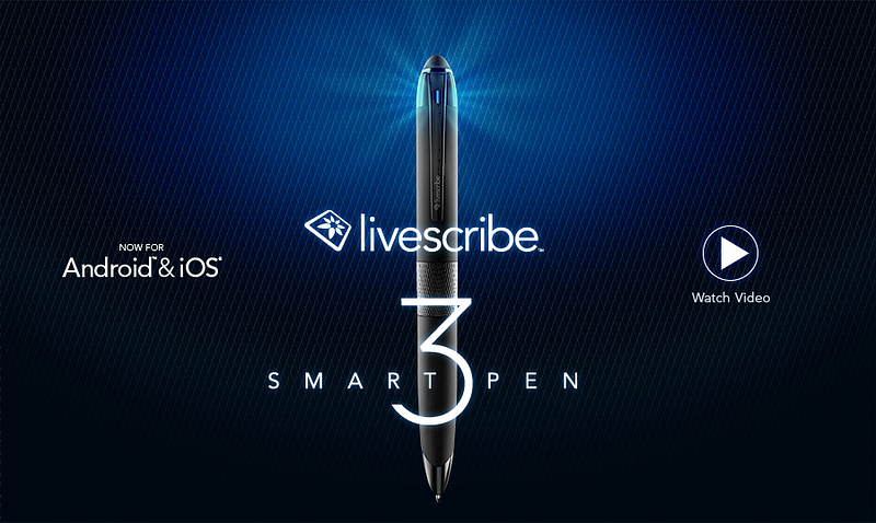
Voice context attachment — A good example of this concept is the Livescribe pen. It allows users to write notes that are stored digitally while recording audio to add context. I admit, it’s a more novel idea that won’t be for everyone, but its potential is clear in a professional context.

Metadata — Other than location there are other metadata elements that can be kept with the messages. How fast you type, how strong you press the keyboard, where you are located, who is around you. The possibilities of enhancing the text and providing context are endless and have barely been explored.

It baffles me that no one has done this yet. The cloud actually has more capacity to interpret a message and learn from context. In photos apps like the ones by Google or Samsung, you can see more and more belief in context including location, details of the picture, live photo etc. All these elements should be collected and added when they are relevant.

Engagement and emotional reactions — With services like Bitmoji users can create their own personal stickers. An exaggerated instance of themselves. Seeing this in the world of video would be very interesting. Psychologically these stickers help users to enhance their emotions and share content in a way they wouldn’t if they were communicating in person.

In addition, Masks on Snow (live filters in Snapchat) also helps user express their feelings but at the moment it’s just some weird selection that has a fragment of a context to where they are or what they are doing. You can see how users just post themselves with a sticker not to tell a story but for the fun of it. If they could tell a story or reflect this on reality it would be emotionally usable which will elevate it as a mode of expression.

Comfort of Use

Comfort depends on the way users use the communication. Important relevant detail surfacing and accessible ways of communicating are the backbones of the UX.

Contextual pinning — Recently Slack added an incredible 90s feature “Threads”. If you’ve ever posted in a forum you know that this is a way to create a conversation on a specific topic. Twitter call it stories and Facebook are just using comments. But the story here was the conversion of this feature to the messaging world and that generated a lot of excitement among their users.

However, I see it as just a start. For example let’s say you and a few friends are trying to set up a meeting, and there is the usual trash talk going on while you’re trying to make a decision. Later another member of the group jumps into the thread but finds it really hard to understand. What has been discussed and what has been decided? If users could pin a topic to a thread, and accumulate the results of the discussion in some way it would be incredibly helpful. Then they could get rid of it when that event had passed.

Here is another good example

https://blog.google/

Accessibility

Image/video to message — instead of just telling a user “Jess sent you a picture or a video” you could actually try to tell the user something useful about that picture/video. Currently most notifications systems are limited to text so why not take advantage of the image processing mechanism that already exists? In other richer platforms you could convert the important pieces of the video to a Gif.

* In that context it’s quite shameful that Apple still doesn’t do bundling of notifications which really helps to tell the story the way it happened without spamming the user. I’m not sure I fancy Android O’s notification groups, but it’s definitely better than creating an endless list of notifications.

Voice type emojis — Keyboards are moving towards predictive emoji and text. They understand that having a different keyboard for emoji is a bit complex for the user, especially since they’re used a lot. A cool way to unify it is to create a language for emoji to make it easier to insert them into messages via voice.

In text translation — We’ve seen improvements from Skype immediate translation and Facebook / Instagram’s “Translate this”. Surely it makes more sense to have this in a chat rather than on the feed? I’m sure not too many people talk to other people in a different language, but if users had such a feature, they might do so. This could also be a great learning tool for companies and maybe it’ll help users to improve the translation algorithm.

See you in Part 2…

Recruiters don’t work for startups — Why I’m cutting the middleman

We’ve all seen Google’s search results when you type recruiter. I’ve read multiple “open letters”, hate posts, attempts to explain how “companies” and “candidates” should be treated. I have recently experienced it from the “company” side, which surprisingly is even more annoying than the “candidate” side. But that’s not the purpose of this post. The purpose is to focus on recruiting for startups, how it is now and how it can possibly become better. Obviously I’ll start with a short rant, but after I’ll try to gracefully outline some new thoughts and ideas for making this work.

Once upon a time…

Well actually it was a couple of months ago, I started scouting for developers for my platform and posted a naive message on LinkedIn. I was hoping to get some replies from interesting developers. Within one minute of posting, I received a phone call. It was a recruiter. I’ve written before about the pyramid of communication. Obviously, it threw me off when a salesperson called me without my permission. As far as I’m concerned, people should call if they (1) Want intimacy (2) Have something urgent to say (3) Are close to me and want to tell me a long story that it’ll take too long to write. But because it caught me off guard I agreed to talk to the recruiter.

A few days had passed and as a result of that post I got loads of messages, all from recruiters. Actually, I also posted the request on Facebook. The overall result of my 3300 connections in LinkedIn and 1700 friends in Facebook amounted to 20 messages from recruiters and one friend that recommended a person. That’s a pretty crappy return on what’s supposed to be the core value of the platform — namely finding employees.

The following week was full of unexpected calls from recruiters, contacting me left, right and centre whenever they felt like it. Some calls were even at weird times. And of course everyone leaves voice messages instead of sending an email.

We had a couple of interviews and after the first batch, we realized that the definition of what we were looking for was wrong. The recruiters didn’t get it, it was the developers themselves who explained it to us. So much for expert recruiters who can translate your need into reality.


I must admit I’ve experienced two approaches from recruiting agencies. The first is ”I’m not working till I’m promised money because I don’t want to waste my time”, the other is “we give you value then up-sell”.

Working in a startup has many unknowns to tackle, therefore, I prefer to minimize unknowns especially when it comes to burning rate. So even with agencies that didn’t mention their terms, I defined in advance a day rate including the agency fee. The problem was that, even after taking that step, once the agency saw I was interested in a candidate they started renegotiating the rate. Time is the most valuable asset a startup has and since a big part of my time is prioritizing and planning I have zero tolerance for things that waste my time.

Let’s talk about money

The recruiting agency model is most definitely not matched for startups. Let’s assume a person is 100 per day, a recruiter will take between 15–25 percent on top of that. For every day a person works for me, I will pay 100 to them and 25 to the recruiter, and the best part is that’s how it works forever.

If you want to hire a person permanently it’ll be a bit different. You will have to pay 20–30% in one go. So if someone earns 100k you will have to pay 30k immediately, after their probation is over.

Big companies save so much money by having their own HR and processes but also reluctantly sometimes use recruiters if they need to grow fast. But for a startup who raised seed or A round money, the prospect of subscribing to recruiters forever, or giving an immediate payout for a perm role is foolish.

Professional startup consultants

Solicitors, closers, and advisors learned and developed ways to work with startups, by agreeing to risks, getting paid a bit now and then more later. Startup employees who also believe in the company do the same. To me it makes perfect sense, and recruiters should see an amazing prospect here too. The startup can continue hiring through them for a very long time, and maybe at some point even buy them as their HR department. You’d think that would work for everyone involved.

But throughout my experience, I haven’t seen any flexibility, no models that work well for startups. The business world has evolved, but it feels like the recruiting world has stood still. After all, what does a startup need when it comes to recruitment:

  • The ability to understand they made a mistake and terminate a contract quickly if the person doesn’t fit.
  • The support and connection of people who believe in it.

What does a startup have to give:

  • The promise it’ll be new, agile, interesting and revolutionary.
  • A return on investment of either time or money.

I think more recruiting agencies should start developing a model for this. The corporate world is brilliant but the startup world has much to offer too. Invest in startups and we will be grateful. I promise you it will translate into long-term working relationships.

The whole reason to choose a recruitment agency is to save you time, but I guess I’ve learned there are no shortcuts here. My advice to myself is to use personal recommendations (like we did so far) and go to meetups and find people myself. Maybe one day when there are good models I’ll test the recruiting world again, but at the moment it feels dated and rigid.

How to make recruitment work for startups

Flexibility

In a startup things are unexpected mainly due to inexperience. Lack of experience could be reflected in: legal, recruiting, management etc. In addition, the startup might pivot or get hit with a lawsuit or a partner crisis. The startup world is hard and unstable, so warmth and flexibility help oil the joints.

Flexibility can also be reflected in the lack of pressure recruiters put on businesses. Work with the startup on their terms. Have a weekly meeting with the CEO about new candidates. Be a part of the mission, anticipate the needs of the company and suggest what roles could help it develop. Instead of bombarding us with emails and phone calls that just distract and create antagonism, let the startup cope. The CEO will talk to you when they have time and if they don’t it’s not your place to push. It probably just means that priorities have changed.

Money

Fire quickly — In reality this flexibility could be in the financial model a recruiter offers a startup. The ability to fire fast is key, especially during the probation period. Big companies can afford to keep the contractor for another two weeks, but in startup life two weeks are like two months.

Vesting — Percentages and big chunks of money don’t work for startups. It’s just not sustainable. Top candidates come and work for a pay cut and blue sky options. They come because they believe in a mission and are willing to work together to make it happen. A recruiter should also believe and invest in the same way. If you are vested the startup will continue working with you. With startups it’s not all about now, it’s about the future. There’s a chance it’ll turn into a Unicorn company and that you’ll have 50% of their recruiting cycle. That’s a lot of business that is good for everyone.

Permanent roles — Let’s face it, in a startup having a perm position doesn’t promise the stability it does in a corporate. The wheels are moving fast, the pressure is high and statistically employees stay less time…mainly because most startups fail. So instead of taking a huge chunk at the beginning, stretch it over a couple of years to make sure it’s the same amount of value a corporate client gets. Yes, there’s a risk involved, but that’s unavoidable when it comes to dealing with startups.

Long-term value

Find a way to give value that stays with the company. Recruiters search for and know many candidates and they can use this to the startup’s advantage. Having a database of options that are a match to the startup could be great for the future. It might not work out today, but it’s definitely valuable for tomorrow. To facilitate that a new account management system should be in place. Imagine an SaaS model for a startup or a yearly subscription that helps the startup keep track of potential employees, ready for the day when they can hire them.

Invest

Startup recruiters should be like VCs and investors. The market is big and many people are looking for jobs or employees. Allow yourself to be selective about the people you work with. Make sure the company you are recruiting for will survive the next six months and if you believe them then invest and create a long-term relationship. Build a pricing range that says, for example, in seed money I will get x% per employee I put to work there, in series A the percentage will grow and in series B as well. Start thinking outside the box when it comes to charging, rather than relying on the current structures that are so ill-suited to startup businesses.

Linked interests

Help the company and advise them as an HR expert. Help them to retain candidates as then your percentage will grow the longer they stay. Link the success of the employee to your success. If they get promoted or stay longer it might help you as well.

Summary

As a recruiter you don’t need to prove that you can find one person who can survive 90 days in the company. You need to be able to continuously bring value when needed and grow the current value based on experience and your success. Recruiting should be less like pimps and more like a long-term relationship. It requires trust, understanding and hard work, as well as support in the bad times as well as the good.

In today’s fast-paced world people move more. I don’t know if it’s because of interest, ambition, boredom, recruiters or bad management. But what I do know is that if someone did a good job for me I’d want to see them again and offer them another job. We’ve all got people that we like working with and that we love to hire, I’d like to see recruiters join that group as well.

Subtitles were never designed. The missing element in TV typography design

In the past three years I’ve been designing televisions and audio systems for Samsung. Throughout these years I found a problem that no one tried to tackle. It’s not a sexy problem but it’s so essential that it’s a crime not to fix it. Unbelievably we are talking about typography in Subtitles.

All major companies take their fonts very seriously. They design it to match print and digital. They produce different weights dedicated for specific usages. Finally, there are guidelines on when to use different sizes and colors. There are also fonts for Television but subtitles are somehow neglected.

Source: Giphy

Software companies are not the only ones that had neglected subtitles, TV content companies also neglected them. It seems that this such important piece of design is an afterthought or just a blame that is being thrown away from software companies, to content creators, and hardware manufacturers. This is from the BBC website “Subtitle fonts are determined by the platform, the delivery mechanism and the client as detailed below…subtitles cannot be accurately determined when authoring”

Let’s have a look at a few Subtitles experiences:

Apple — Even in the human interface guidelines there is not much about subtitles, just the accessibility options that do not include

BBC

BBC Screenshot: Grand designs

Amazon — has nothing in their guidelines about subtitles beside the ability to turn them on and off.

Amazon Website subtitle options (screenshot)
Amazon video app subtitles options (screenshot)
Amazon Fire TV subtitle options firetvblog.com

Netflix — Loved their answer to why subtitles are important “Subtitles and closed captions have historically been deemed a secondary asset. Even our own technical specification lists subtitles and closed captions (timed text) among several types of secondary assets that NETFLIX requires. The reality is that for millions of our members around the world, timed text files are primary assets.”

Too bad it’s not reflected in the design of it.

Netflix default subtitles (screenshot)
Netflix app subtitles options (screenshot)

Google — Google has lot of options and they are the only ones that allow font change, but still non of these fonts were designed for TV.

Google Play Movies app subtitle options (screenshot)
All of Google’s subtitle’s options

TV fonts special characteristics

Distance — Unlike other platforms the distance between the observer and the TV is the most static of all. Reading printed materials can be held in different distances and angles which affect the size and light emitted on the paper. On the mobile, the distance also changes depends on interaction and other elements that appear on screen.

TV is static, the subtitles are always at the same bottom area of the screen, and the distance also mostly remains the same. Of course, there are different distances people choose in their living rooms and sizes of TV, but that’s what accessibility settings are for. The TV size should immediately affect the size of the subtitles and it should be something that is adjusted as a part of setting up the TV.

Color — On TV the background is constantly changing. Therefore throughout the years, there were two main colors that were featured as default in subtitles: yellow and white. These two colors are less common on TV. It’s not easy to shoot things in yellow or pure white (unless it’s a scene in the snow). However, since the background keeps changing it is impossible to rely on one color or alternatively keep changing a color when its background changes. The next two solutions came as an addition to the color change.

Background — Many subtitles have text and behind it, there is a background. This helps to differentiate the font from the moving background while helping Readability and clarity. However, background is not the first choice most services do.

Stroke — I find it somehow strange that stroke is the most common way to make sure the text is visible in subtitles. The main reason is that fonts are not designed to have a stroke, they design to work as is. When a stroke is applied on a font it’s eating out of its fill or alternatively out of the negative space. That makes it much less readable. The most common usages of stroke are also featuring heavy contrast like Black contrast on white or yellow fill.

Even on an S the easier less complicated letter the stroke definitely destroying the character’s design

*In weird cases, few companies decided to place a shadow on the colored font. That’s terrible.

Speed — With subtitles it is essential to understand that the users don’t have all the time in the world to read them. In some languages, speech is faster or words are longer. In English, the average time for reading a subtitle line is 3 to 5 seconds. Therefor readability here is even more critical.

Source:Giphy

Multi-language — Mainly in countries that don’t dub TV shows there is a need to subtitles that are in a different language to the original movie. Some countries’ subtitles appear in two lines: First line is translated to the main country language and the second to a second language. In Israel for example, subtitles appear as Hebrew on the first title and Russian or Arabic on the second line. One can only imagine that this makes it extremely difficult to read if there is no consistency in the attributes between the two. There are fonts that are designed specially to match well with another language fonts. This should also be applied in TV.

The extra step

Throughout my exploration, I couldn’t find out where or who dropped the ball on this issue but I think it’s also a great opportunity. Companies have worked so hard creating and owning their own user experience across platforms. Especially now when linear channels ebbing and on-demand services are on the rise it’s time to invest and create an inclusive experience.

Typography is amazing and creating fonts for titles or posters is fabulous. Creating for readability takes longer and it’s less sexy but it provides an enormous value that lays in comfort rather than astonishing. Additionally, it’s fame for life across all of a provider’s services.

A font that takes into account stroke, colors and different backgrounds for speed reading on TV. A translation of the OS font to a proper subtitles font. I am hoping for a better, readable TV experience.

The world of subtitles is fascinating and there was incredible work done around it in terms of language, sentence design and following flow and content integrity. But after all this somehow the fonts had been neglected.


If you are interested and want to read more about subtitles try these:

BBC http://bbc.github.io/subtitle-guidelines/#presentation

The most detailed one.

Apple Tv fontshttps://developer.apple.com/tvos/human-interface-guidelines/visual-design/

Not speaking about subtitles at all, just fonts

Google Material designhttps://www.google.com/design/spec-tv/style/typography.html#

Not speaking about subtitles at all, just fonts

Netflix https://backlothelp.netflix.com/hc/en-us/articles/215758617-Timed-Text-Style-Guide-General-Requirements

There are no design consideration, just structure and timing.

Communication pyramid

It is often said that “You are who your friends are,” but in many ways your friends are a product of the environment which you grew up in, your parents’ friends, and the schools and universities you went to. These coteries were hard to penetrate, but now things have changed. In this world, where we’re all led into social bubbles, there are more opportunities to form connections based on content and interest. For example, there are theme-based groups on Facebook, services like a platform for dog lovers, or physical running clubs. In a world where it takes longer to get to know a person and their friends, you can learn about them from the groups they associate themselves with.

Class based parties | Illustration by Tomer Hanuka

In the past, a talented person could have worked all of their lives and not been discovered. Relationships were created only through face-to-face interactions. It was harder to accept that which was different, as it wasn’t as visible. When different came concealed, it got interpreted as threatening. But today, there is an attempt to celebrate this variety and emphasize it. Today, parents care less about naming their kids the same as others; they prefer names that are easier to find on Google.

The value shift was inspired by celebrities and the ability to share. As a result of this, developing special talents, being able to communicate online, and networking are skills that everyone should master in the quest for a normal life. Through this process, the communication hierarchy changed as well. If your communication skills are good enough, you can skip steps and write something worthwhile to your idols. It might change your life.

Special talent? | Photo by Emily Stein

Making friends

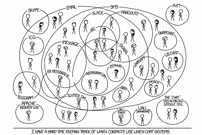
Let’s say, for example, that you had a few friends over for dinner and you decided that you liked one of them. How should you proceed with contact after that dinner? There are so many platforms to focus on: messaging, expressing opinions, and sharing your story. It is important to acknowledge that each one of them is good for specific things. Due to the nature of growth in a commercial sense, these platforms all aspire to be the same, but they are not.

The methods of communication today are completely different than they were a few years ago, but the principles and what people value have remained the same. Across platforms, the level of commitment dictates the importance of that platform to the user. The three levels are:

Consumption: A user is there to read and absorb.

Participation: A user is active and talks to the community there.

Leading: A user has many followers and sets the tone while talking about subjects that interest them.

It is really hard for a regular person to be fully engaged in all platforms, so users choose what’s better for their character in conjunction with what’s popular and used within their circles. No one commits to only one platform, but they definitely focus most of their communication efforts on just a couple of them.


I’ve tried to sketch the principles that drive the usage and hierarchy of these platforms. Let’s dive into the factors:

Consumption method — The medium, form and digestion time of the information are key attributes of a platform. When it comes to communication, some mediums are harder to create or consume than others. Some require pre-conditions. For example, video conversations have pre-conditions such as: good reception, a quiet place, being dressed, being in the mood, and being willing to reveal your whereabouts.

Privacy — The medium dictates how much is being revealed on that platform. Many people use other people’s content to communicate, as it’s done better or they identify with it. Some also add their own words to explain the context and to give it a personal touch, which is more intimate than just pressing “share”. Since most of us are not the best storytellers, the rawer the content is, the easier it is to see through to that person. Some platforms are more about public sharing; therefore, they are less intimate and lower in the communication pyramid. Yet some people have a unique expressive personality, which usually elevates them to leaders of a platform. A high level of expressiveness means that it’s less private.

Immediacy — Timing is everything. The more intimate you get, the more the other person will let you disrupt what they do in favour of communication with you. Thus, it is easier to contact a person or start a relationship in a place where there is no need for immediacy. Feel the vibe and see when you can jump in and ignite a conversation; for example, the pace at which messages are exchanged dictates whether it’s a conversation or not. When someone slows the pace, they probably want to end the conversation or are busy with other things. It’s a shift in priority.

Emotion — The more you reveal, the more emotional it gets. In videos, we reveal facial expressions, tone, and environment, whereas text messages can contain a tone, but it can be very difficult to interpret. Stickers and emojis help by giving more emotion, but it’s not the same as face-to-face.

Immersion time — Every relationship is built on time spent communicating, and the same goes for the platform itself. The more time a user spends there, the more comfortable they feel about communicating there. Friction (difficulty of use) could be a roadblock to the success of communication. Some argue that Snapchat’s controversial UX contributed to the fact that only millennials use the app. It was simply too complicated for older people to learn how to use it. Familiarity drives engagement.

The pyramid of communication relies on these assumptions. From bottom to top, basic human interaction is about:

Politeness — Being nice to a different person because you happen to be in the same situation with them. In this case, the relationship is harmless to you and you don’t spend too much time thinking about it.

Self-promotion — Measuring yourself as nice, successful, and someone who the other person should want to have a connection with. Everyone is a brand nowadays.

Communication

This is where we have genuine interactions with others. It’s these people that we actually talk to on some basis and have an interest in pursuing positive communication with.

Acquaintances — People that you know you will meet again and whom you might need for some purpose in the future. It is worth keeping a positive relationship with them. This applies more to a work environment but can also, at times, be relevant in personal relationships — for example, parents of other kids from school. Another way to look at it is the concept of followers or people collection. In terms of public sharing, these are your digital acquaintances.

Far friends —people that are close to you; friendships that have lasted over time.

Close friends — People whom you talk to on some sort of a regular basis.

Relationship / Partnership — People whom you talk to on a daily basis multiple times a day, share information with through multiple platforms and have associated contacts.

This leads to the platform distribution across social circles:

Joining the journey: If someone posts their personal life or whatever they want on a social platform like Instagram or Twitter, it means that they are OK with people from around the world seeing it. This makes it OK for you to look at it. There is also a chance they won’t even know that you are now following them unless you start interacting with them on the platform by liking their stuff or messaging them.

Messaging platforms: There is one thing that really differentiates them from one another: what kind of login they’re based on. For example, Hangouts sits on your Gmail, WhatsApp sits on your phone number, and Messenger sits on your Facebook.

This distinction is extremely important since most people don’t fiddle with the privacy settings. Therefore, if you want to talk on Messenger, you’ll need to be Facebook friends or else it’ll go to a section which could be missed by the person you want to contact. However, that user might prefer communicating in a different way, since being a Facebook friend of theirs would give you access to all of their photos, and they might not necessarily be keen on that. A phone number will give you the ability to actually call them or SMS them, which is also intrusive.

For millennials, Snapchat would be less intimate than Messenger and WhatsApp mainly because it is ephemeral. They are less worried about it staying there. They will be savvy enough to block a user from watching their story, while still allowing communication. Snapchat doesn’t block any user from just adding you, following you, or communicating with you — similar to Twitter and Instagram.

Live video and Video stories — These make it much more immediate and easy to know where you are and when. That could lead to really creepy scenarios, where someone just shows up because they saw that you were in a particular place. Alternatively, they might start to hang out there in an effort to meet you, which is a tiny bit less creepy (but appreciated).

Actually talk (Phone then Video) — Jesus, does anyone call you besides your parents or recruiting agencies? I remember hearing someone talking on the phone on the bus, and then telling my wife that it was so rude. Talking in a way so that everyone hears you? No — talking on the phone in public at all! Ninety per cent of my friends text me before they call, to ask if it’s fine to call. By the way, I’m OK with just calling; it’s so exciting when this finally happens.

I want to put aside the case of audio messages and video messages. It is a bit weirder because it introduces a lot more friction. Many times you are in areas where it’s not really appropriate to talk or consume that message. Moreover, since you don’t know what it contains — we all have that friend that sends porn (yeah, I’m sure I’m not the only one that these things happen to) — you don’t want to view or listen to it around other people in case it’s inappropriate.

I really don’t get why messaging apps can’t translate the voice in the cloud and send it as a text-based overview. That would enable people to get a glimpse of what’s in the audio/video. It seems trivial, especially when they have so much time to compute it.

So, next time you break up with someone, how would you do that? Face-to-face, video call, or Twitter?

Work

The nature of work is different, and it’s mainly reflected in two areas: Privacy (don’t want others to really know what I’m doing in my personal life) and Immediacy (a lot of meetings over long hours). Therefore, face-to-face becomes the most difficult way to communicate.

There is always the possibility to connect via personal, friendly channels, but sometimes it’s simply not appropriate. This is mainly true if it is a corporate person.

Most business-related social networks are not used as real-time communication tools. As a result, people visit them only once in awhile, mainly when they are scouting for a new job. Consequently, the use case is at times wrong. For instance, it is better to know the person’s email address than to find them on LinkedIn if you want a more immediate response. Luckily, this can happen through many of the networking events that happen in big cities.

Getting to immediacy is much harder in a professional world. The emotional aspect seems to be less dominant on the surface of communication.